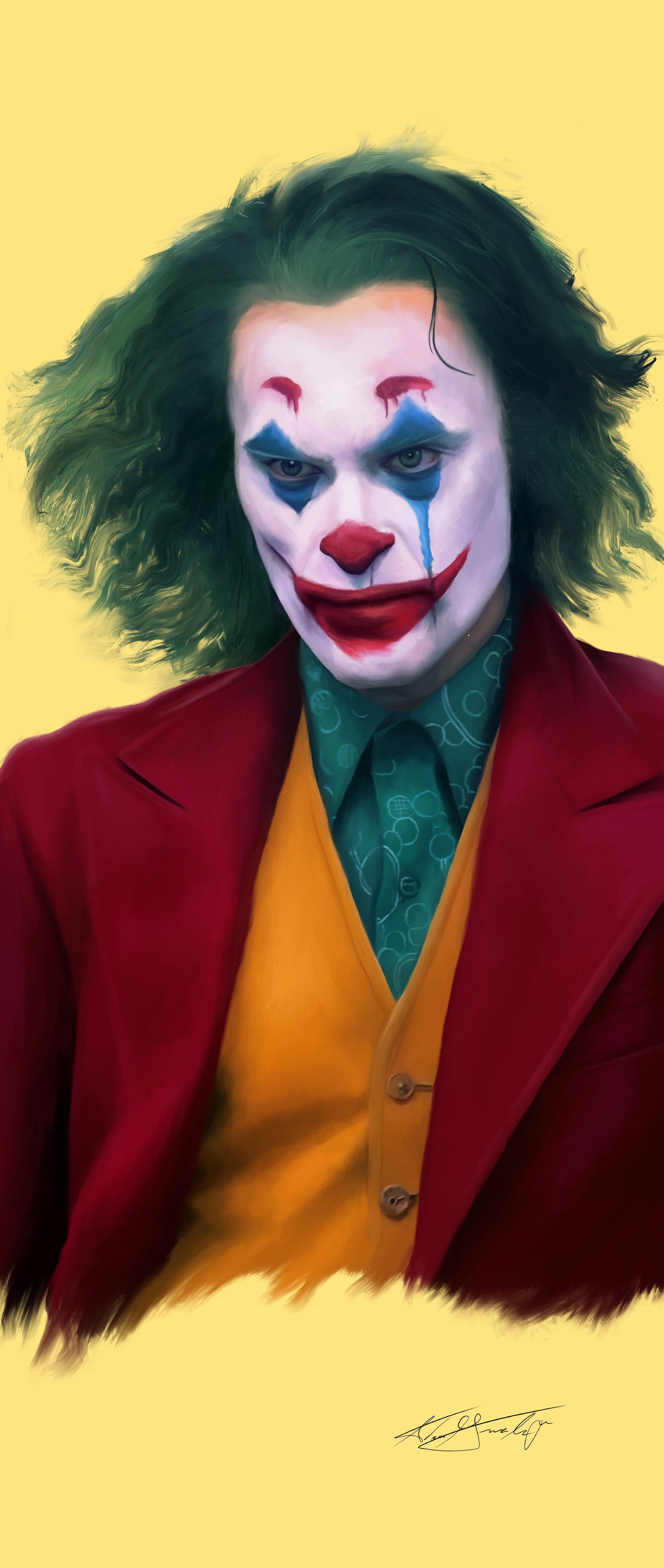
"Joker" - A digital painting of The Joker from the film "Joker" - Procreate for iPad Pro - 2023
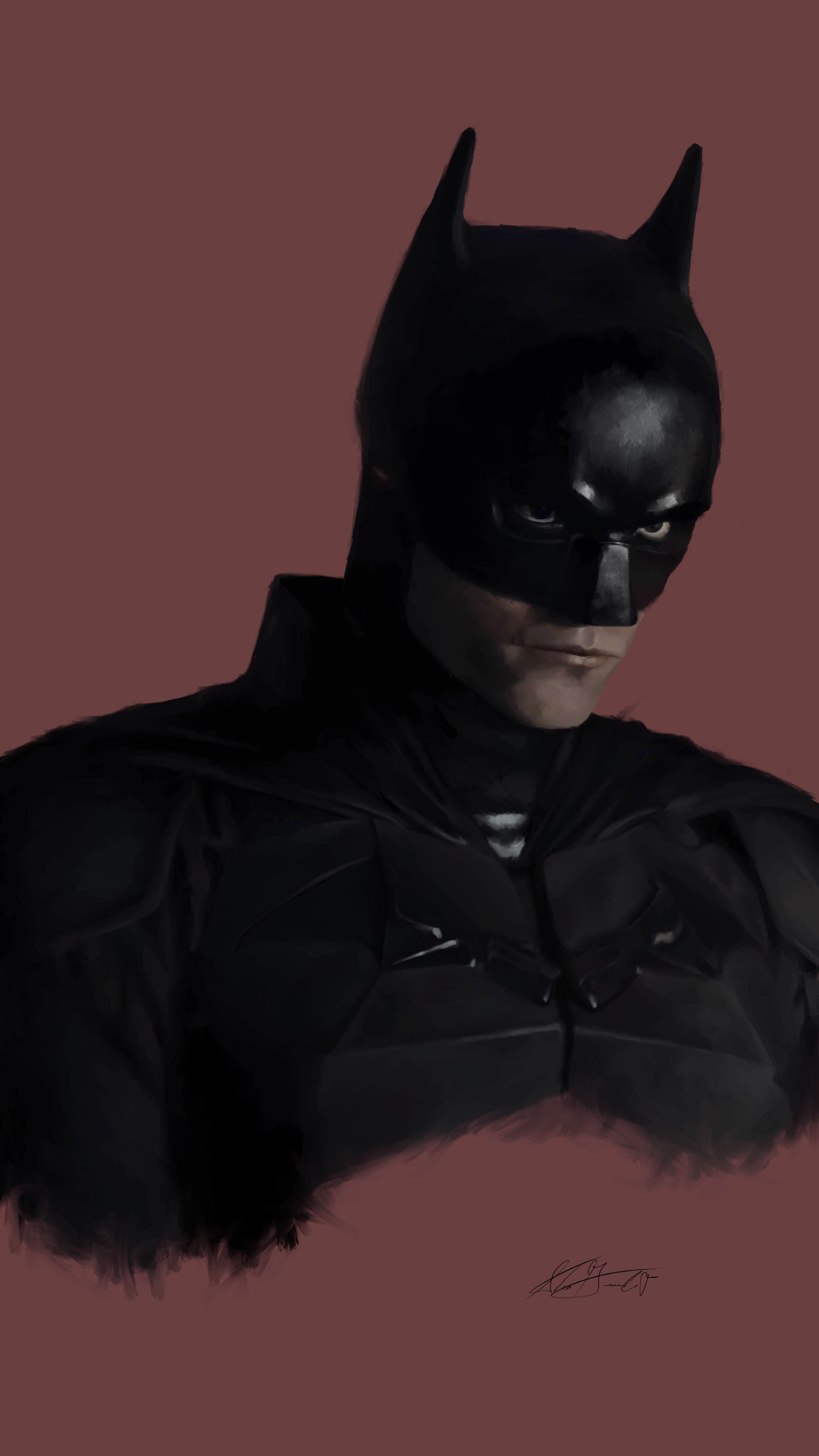
"Vengeance" - A digital painting of Batman/Vengeance from the film "The Batman" - Procreate for iPad Pro - 2023
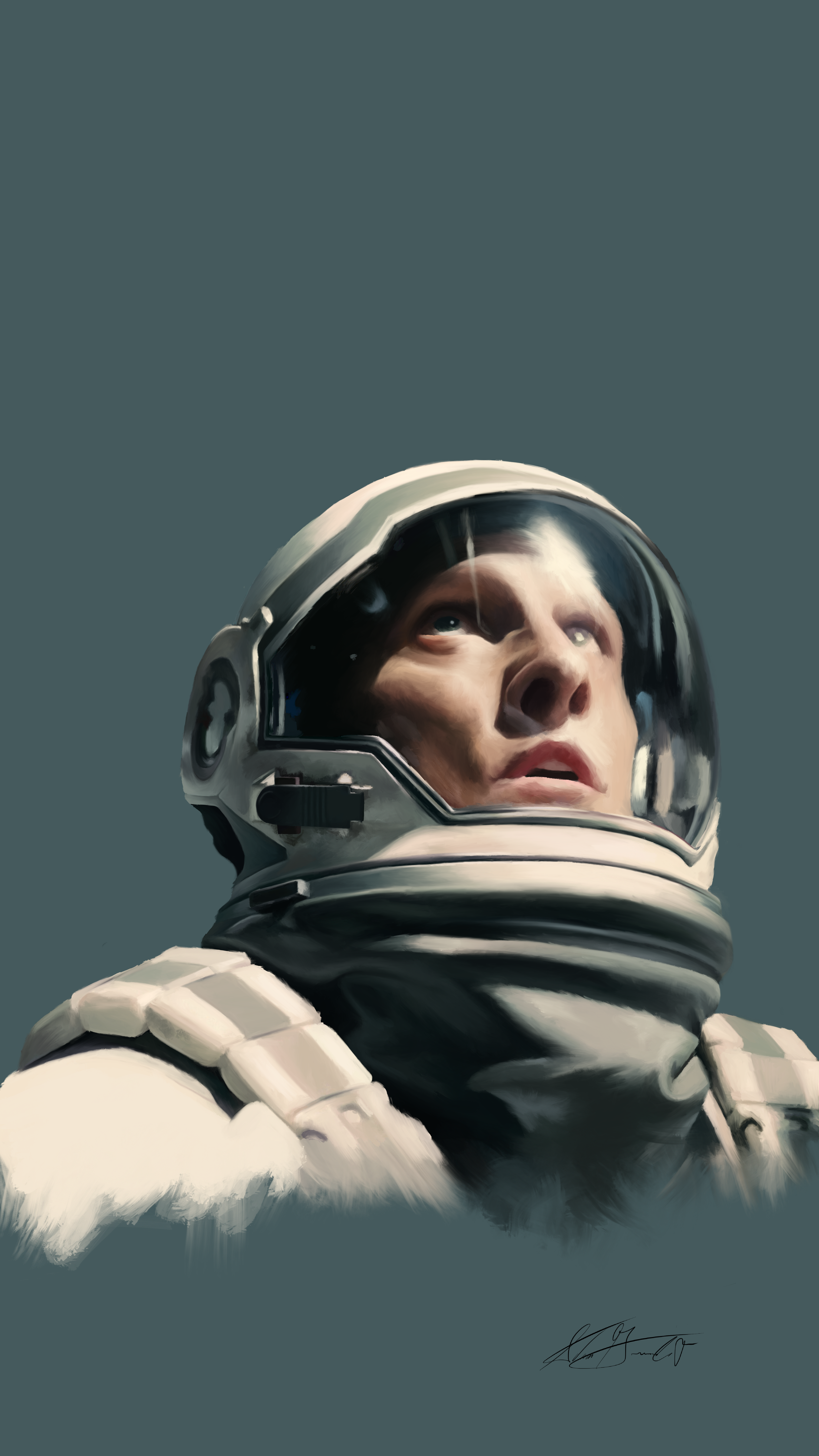
"Coop" - A digital painting of Cooper from the film "Interstellar" - Procreate for iPad Pro - 2023
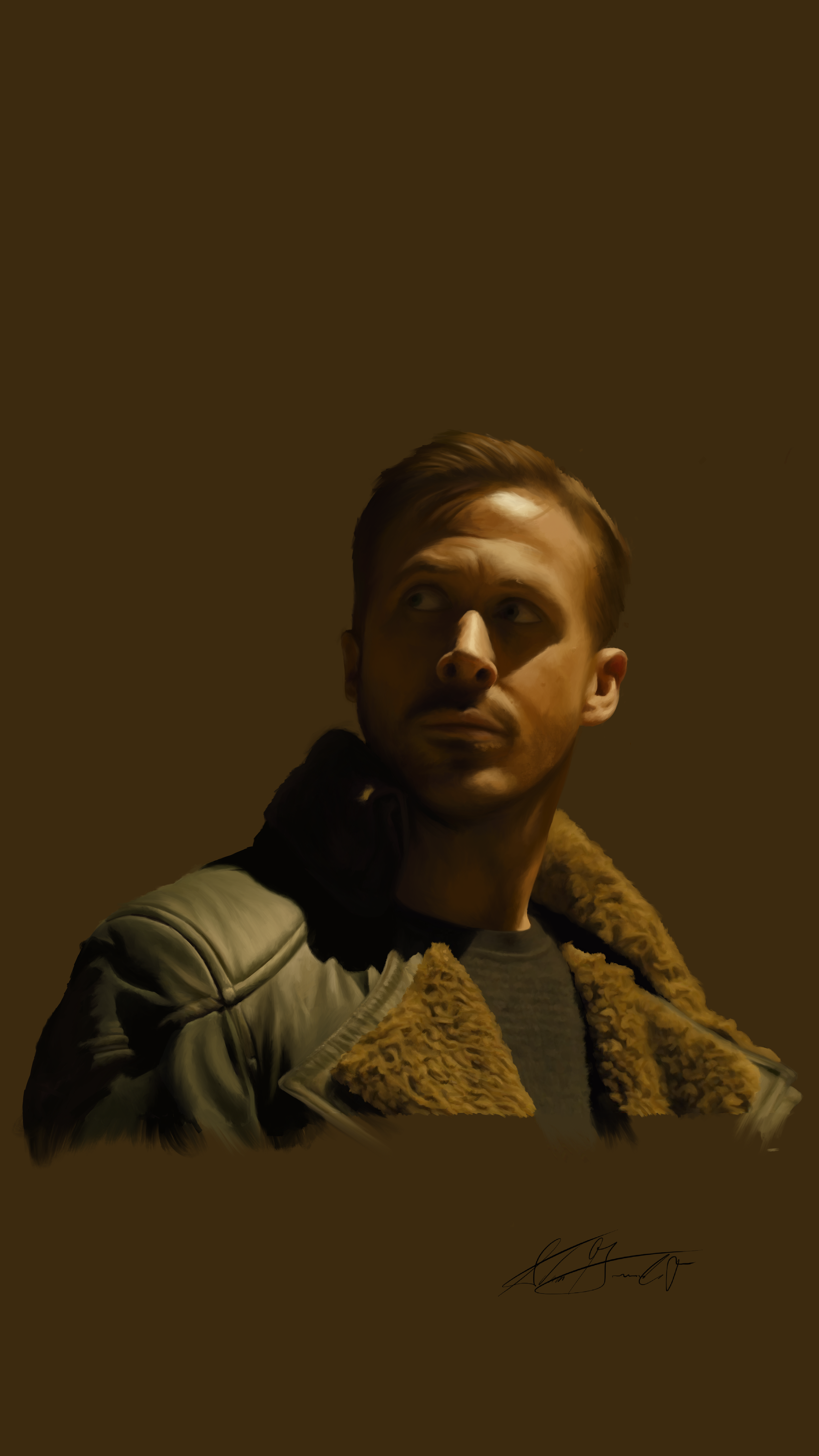
"K" - A digital portrait of Officer K from the film "Blade Runner 2049" - 2023 - Procreate for iPad Pro
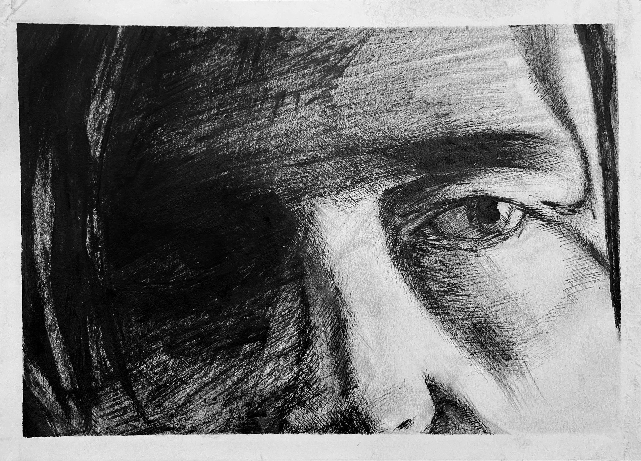
“Masks : Son (1 of 3)” - One part of a tryptic depicting the three faces worn by Bruce Wayne as portrayed by Robert Pattinson in the 2022 film The Batman. One of the film’s central themes is the major identity crisis taking place within the psyche of its titular character. Throughout the narrative, the main character is constantly torn between the identity he was born into, Bruce Wayne, billionaire orphan, and the new identity he has created for himself, The Batman, and avatar of fear, vengeance, and justice. Each of the three postcard sized drawings feature a depiction of the eyes of each face that Bruce wears. Placing such emphasis on the eyes - or as some call them ‘the windows to the soul’ - further delivers the message that while they are looking at the same physical body, the audience is viewing three entirely different identities. This drawing, titled “Son,” depicts the mask of Bruce Wayne, or rather the false persona that Bruce adopts when he is forced to make public appearances. Of the three masks, the mask of the Son is the thinnest, and the one that Bruce feels the least comfortable within. - Ink on Paper - 5” x 7” - 2022
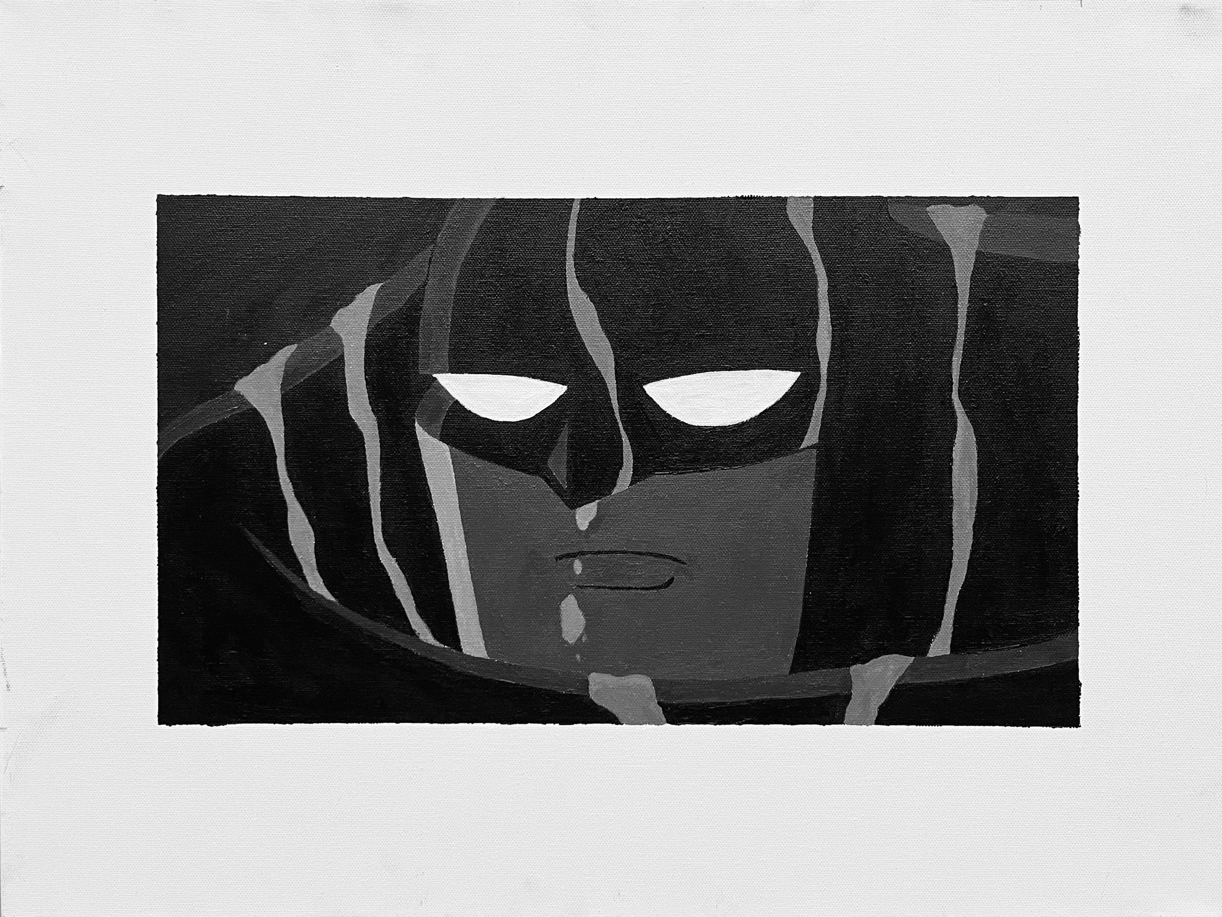
“The Longest Night” - One part of a dyptic titled “A Vicious Cycle.” This painting depicts Batman as he is depicted in the animated film Batman: Mask of the Phantasm. - Acrylic on Canvas - 18 x 24 - 2022
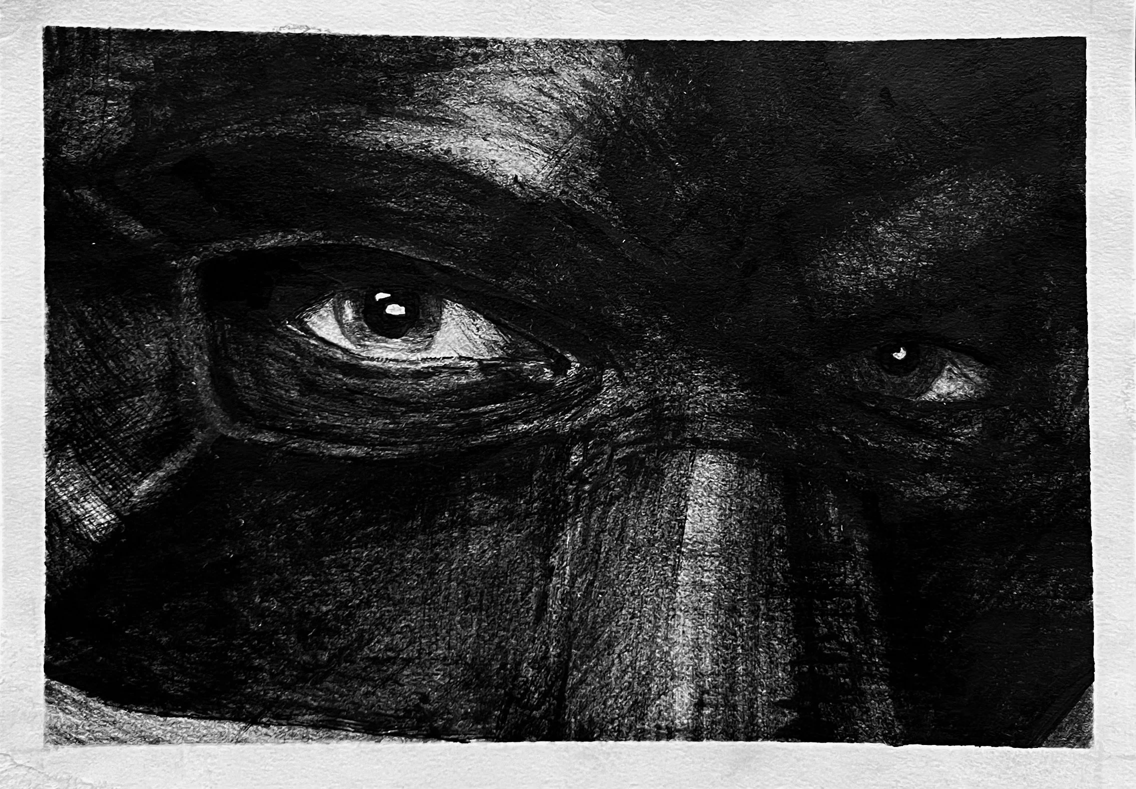
“Masks : Drifter (2 of 3)” - One part of a tryptic depicting the three faces worn by Bruce Wayne as portrayed by Robert Pattinson in the 2022 film The Batman. One of the film’s central themes is the major identity crisis taking place within the psyche of its titular character. Throughout the narrative, the main character is constantly torn between the identity he was born into, Bruce Wayne, billionaire orphan, and the new identity he has created for himself, The Batman, an avatar of fear, vengeance, and justice. Each of the three postcard sized drawings feature a depiction of the eyes of each face that Bruce wears. Placing such emphasis on the eyes - or as some call them ‘the windows to the soul’ - further delivers the message that while they are looking at the same physical body, the audience is viewing three entirely different identities. This drawing, titled “Drifter,” features Bruce in his undercover attire. The job of being a crime-fighting vigilante often requires Bruce to move through Gotham City unnoticed in order to perform reconnaissance missions, gather intelligence, and infiltrate criminal activity. Unfortunately, both Bruce Wayne, and Batman draw a great deal of attention, so in order to gain any sort of anonymity, Bruce dresses in tattered clothes to mimic the appearance of a member of Gotham’s vast homeless population. Appearing as an impoverished drifter, Bruce is completely ignored, which not only allows him to better perform his duties as a vigilante, but also allows him to pretend for a brief period that he is anyone but Bruce Wayne, billionaire orphan with a tragic past. In layman's terms, Bruce would quite literally rather live on the streets as a drifter, than in a luxurious penthouse as himself. - Ink on Paper - 5” - 7” - 2022
“The Endless Day ” - One part of a dyptic titled “A Vicious Cycle.” This painting depicts Bruce Wayne as he is depicted in the animated film Batman: Mask of the Phantasm. - Acrylic on Canvas - 18 x 24 - 2022
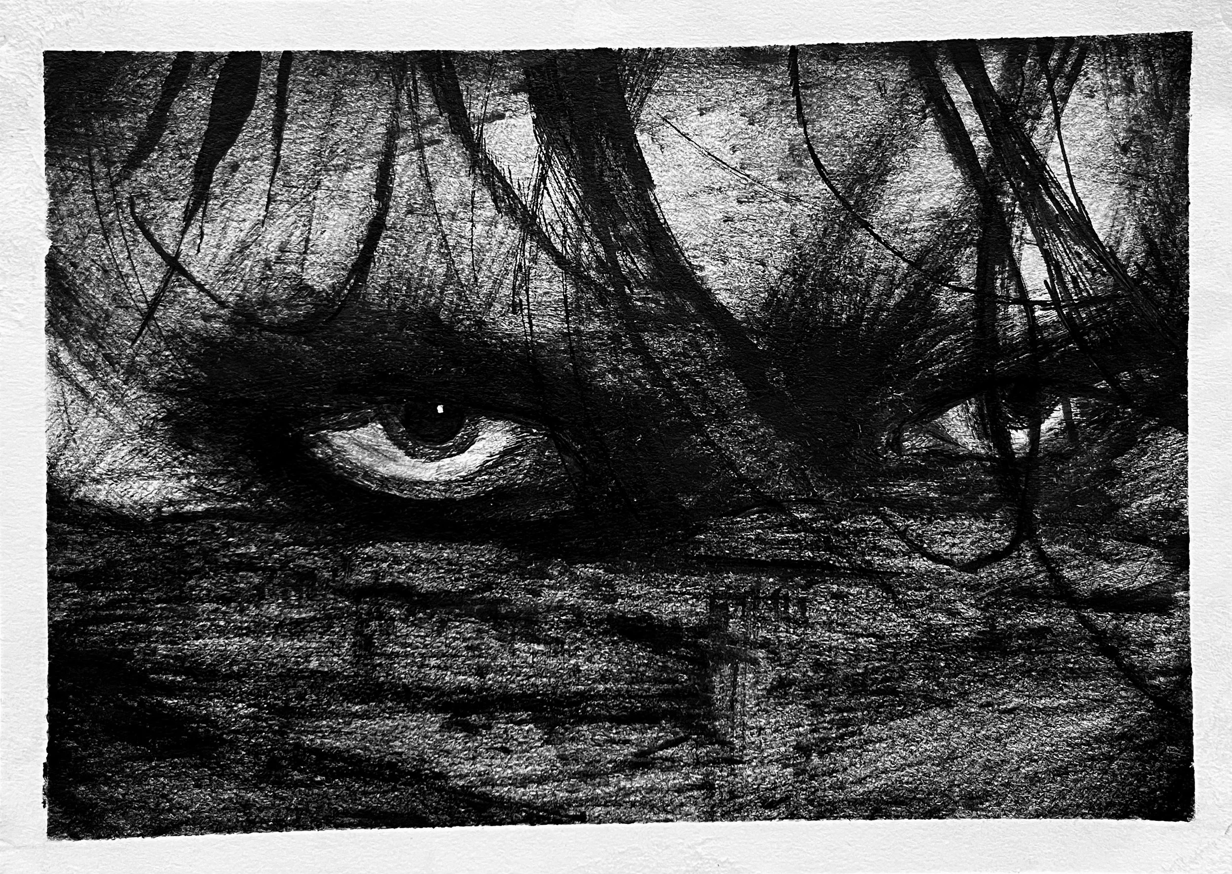
“Masks: Vengeance” (3 of 3) - One part of a tryptic depicting the three faces worn by Bruce Wayne as portrayed by Robert Pattinson in the 2022 film The Batman. One of the film’s central themes is the major identity crisis taking place within the psyche of its titular character. Throughout the narrative, the main character is constantly torn between the identity he was born into, Bruce Wayne, billionaire orphan, and the new identity he has created for himself, The Batman, an avatar of fear, vengeance, and justice. Each of the three postcard sized drawings feature a depiction of the eyes of each face that Bruce wears. Placing such emphasis on the eyes - or as some call them ‘the windows to the soul’ - further delivers the message that while they are looking at the same physical body, the audience is viewing three entirely different identities. This drawing, titled “Vengeance,” represents Bruce Wayne’s final form. After spending the majority of his life struggling to overcome the trauma of witnessing his parents murder as a child, and continuing to witness his city fall deeper into the depths of the criminal underworld, Bruce decided to embark on a new mission as he entered adulthood. He came to the realization that mere men were incapable of making a difference in Gotham’s crime problem, and that if he wanted to protect others from ending up like him, he would have to become something more than a man. Rather than allowing fear to rule him, he became the embodiment of fear in the minds of criminals. He became an idea; a myth; a symbol that stood for punishment of those who choose to harm others, and thus forcing them to at least reconsider their heinous actions before they commit them. Rather than sulking in a decaying manor for the remainder of his life, wishing it was different, Bruce took matters into his own hands. When he goes out at night, he doesn’t simply seek vengeance for himself and others, he becomes vengeance itself, operating as a supernatural force of justice. As Batman, Bruce is free of the limits of himself. Every second he spends as Batman, is a second that he does not have to be Bruce Wayne, billionaire orphan. Hence, he is nothing less than addicted to his work. Being Batman is the purpose he has been searching desperately for throughout his entire life. Only beneath the mask of vengeance, can Bruce truly be himself. - Ink on Paper - 5” x 7” - 2022
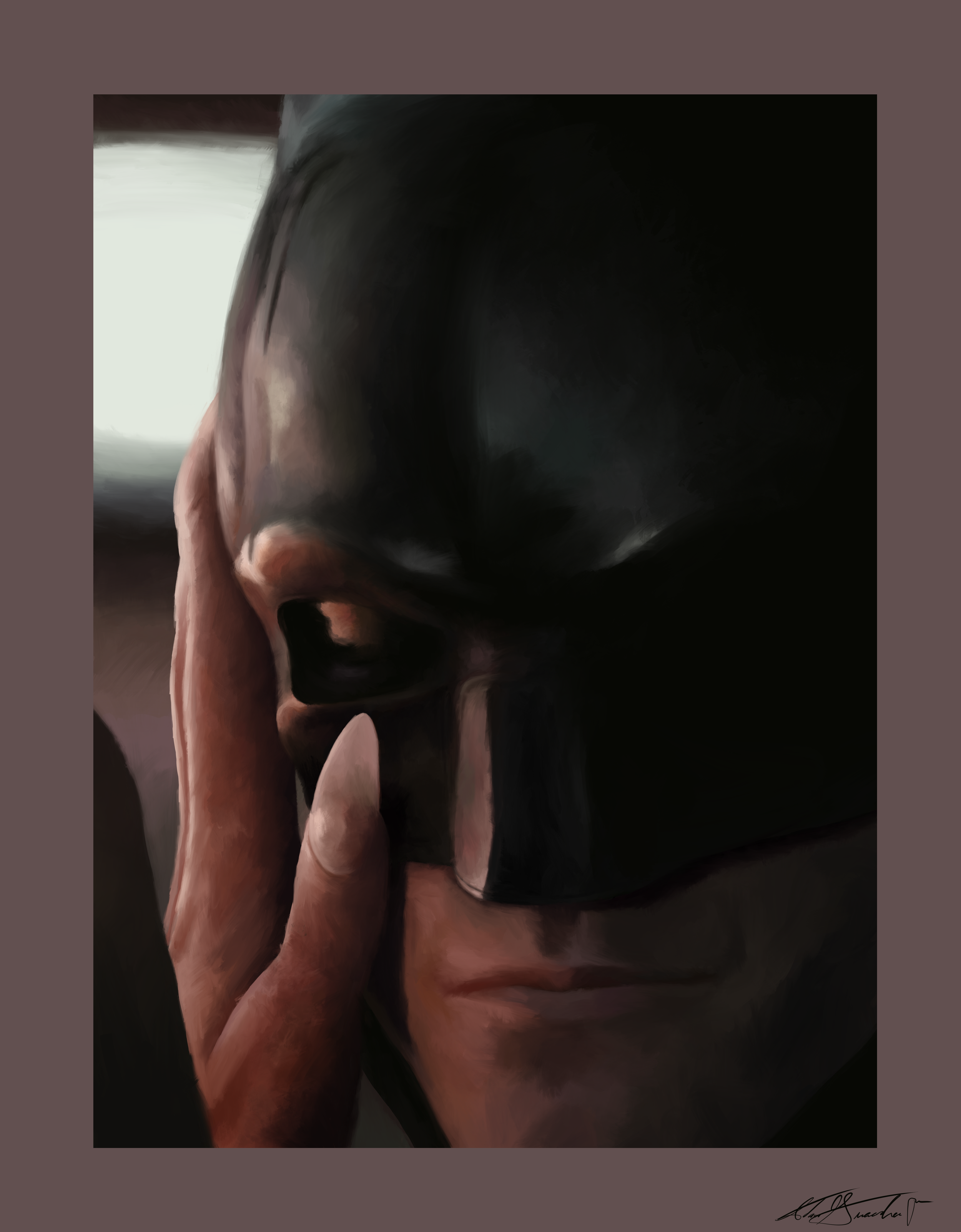
"Who Are You Under There?" - A digital painting of a cropped still depicting a scene featuring Batman and Catwoman from the film "The Batman" - 2022 - Procreate for iPad Pro
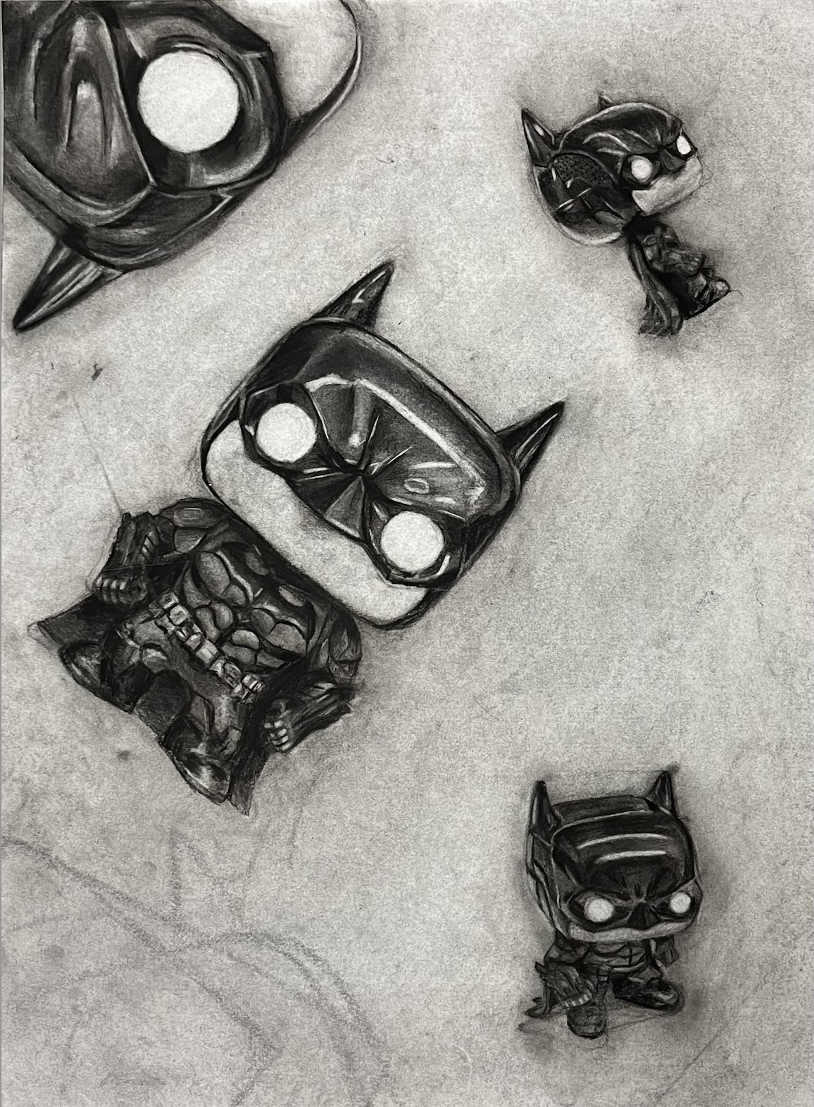
"Batman Funko Pop" - An exercise in arrangement completed in the Drawing 2 course at Butler University. Students were tasked with rendering four depiction of one inanimate object. Each depiction was required to differ in size, angle, perspective, and placement. - 2022 - 18 x 24 - Charcoal on paper
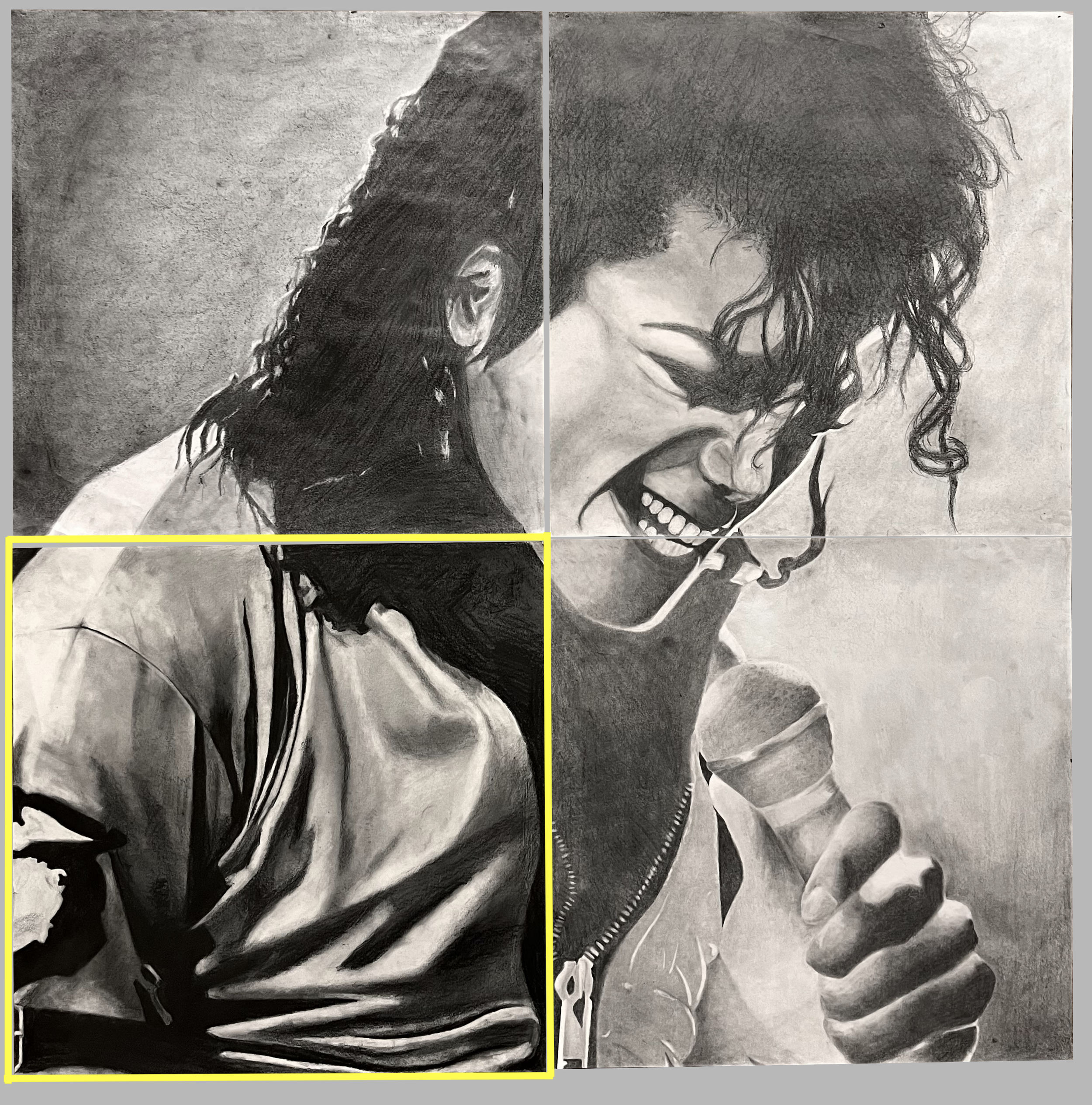
"Michael Jackson" - A group project completed in the Drawing 2 course at Butler University. The project required a group of four students to each draw one quadrant of an image. The four quadrants were then combined to create one large rendering of the entire image. I completed the bottom left quadrant, while my group-mates were responsible for the other three. - 2022 - 18 x 18 (36 x 36) - Graphite on Paper
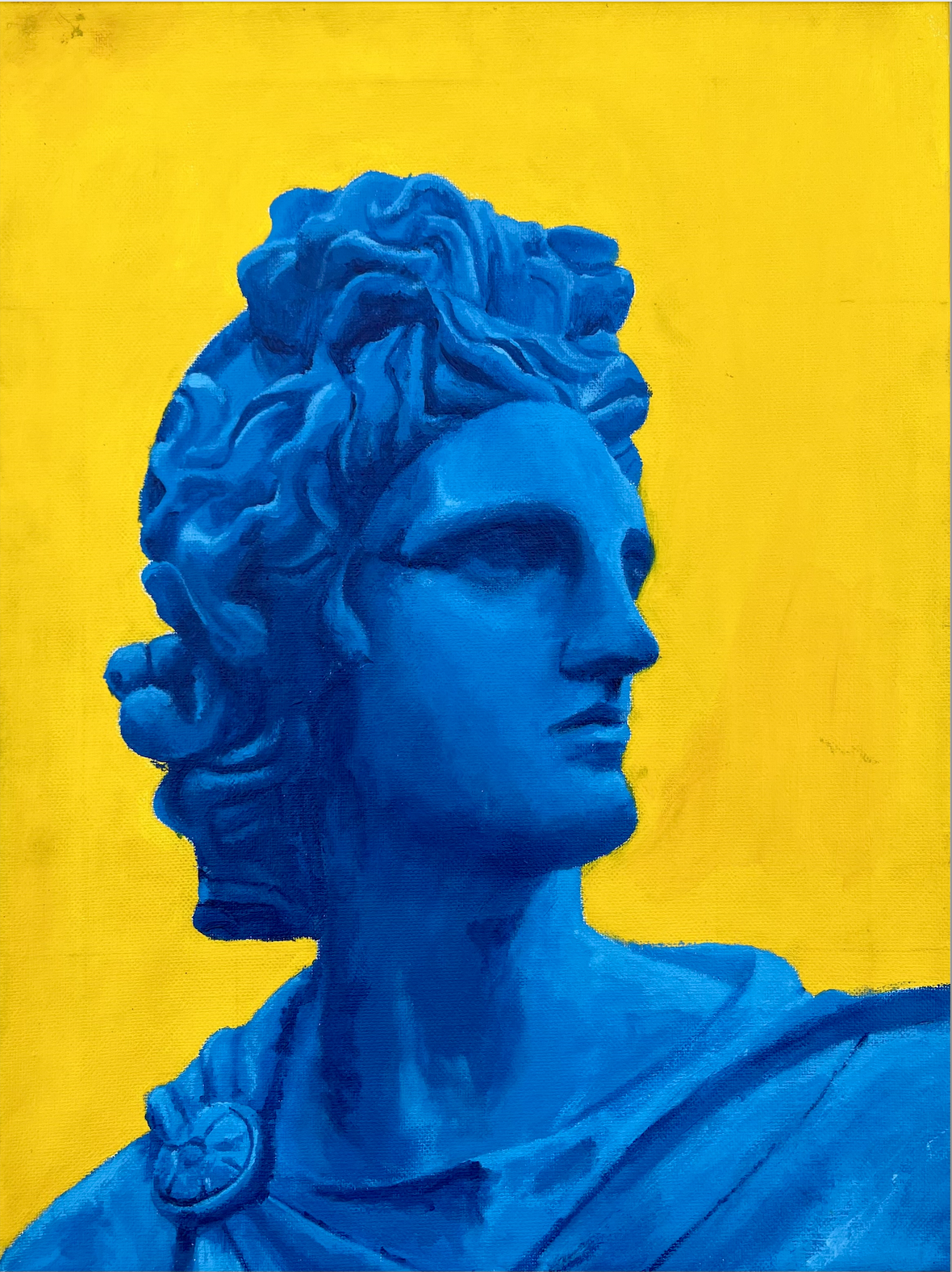
“The Dilemma: Solitude” - One part of a tryptic illustrating a personal dilemma that I found myself frequently encountering during a transformative period in my life. The titular dilemma presenting itself to me was a choice between pushing myself to expand my comfort zone by opening up socially to find new friends, or to remain comfortable in my solitude and risk the potential drawbacks of isolation. In short, I was struggling to find balance in my social life. I wanted to be alone, without being lonely. This tryptic serves as a map of my social spectrum. On the right end of the spectrum is the element of solitude, and on the right end of the tryptic is a painting of the same name. The painting features a portrait statue of a singular figure looking off into the distance. Everything about the figure really spoke to me. Its expression and disposition conveyed such strength and comfort in solitude, while its gaze implied that it was searching the horizon ahead and longing for something beyond. I am very comfortable when I am alone, and I too find strength in solitude. However, solitude is not sustainable forever. Every now and then, it is easy for one to get lost without the benefits of connecting with others. As much as I enjoy being alone, I have come to the realization that in order to lead a healthy and happy life, I must allow others to help me do so. I chose to illustrate the statue in a deep blue hue to illustrate that notion. Solitude is the ocean. In the shallows the icy blue water is cooling, and calming. However, as one dives deeper, the water continues to get colder, and darker, until the surface is but a memory. - Acrylic on Canvas - 12 x 16 - 2021
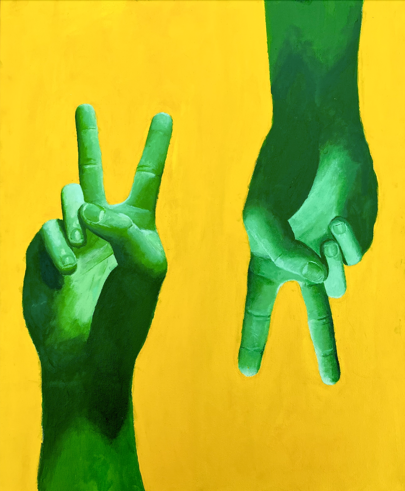
“The Dilemma: Peace” - One part of a tryptic illustrating a personal dilemma that I found myself frequently encountering during a transformative period in my life. The titular dilemma presenting itself to me was a choice between pushing myself to expand my comfort zone by opening up socially to find new friends, or to remain comfortable in my solitude and risk the potential drawbacks of isolation. In short, I was struggling to find balance in my social life. I wanted to be alone, without being lonely. This tryptic serves as a map of my social spectrum. Square in the middle of that spectrum, lies balance, and therefore peace. The element of peace is illustrated by none other than two hands displaying the universal signal of peace. Whereas the other two paintings in the series require some level of thought in order to decipher their meaning, the Peace painting is very upfront with its message. Rather than search for some symbol or idol that I view as an avatar of peace, I chose to leave very little up for interpretation and give the audience a very clear picture of the element that represents balance between company and peace. In addition to traditionally being symbolic of hope, growth, balance, and of course, peace, the color green holds heavy significance in my life. The word green is in my family name, and it is the color that I first associate with my identity. - Acrylic on Canvas - 20 x 24 - 2021
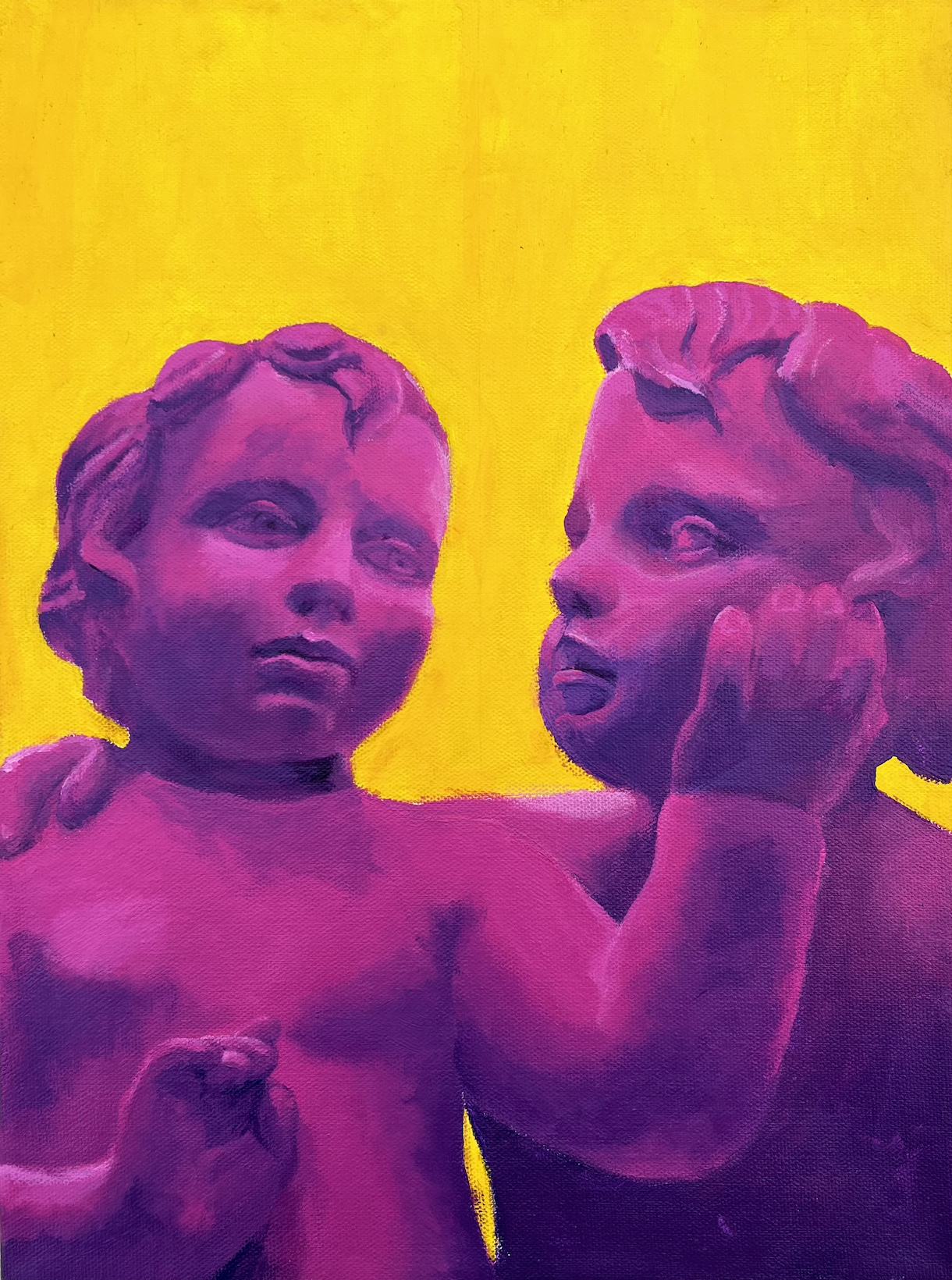
“The Dilemma: Company” - One part of a tryptic illustrating a personal dilemma that I found myself frequently encountering during a transformative period in my life. The titular dilemma presenting itself to me was a choice between pushing myself to expand my comfort zone by opening up socially to find new friends, or to remain comfortable in my solitude and risk the potential drawbacks of isolation. In short, I was struggling to find balance in my social life. I wanted to be alone, without being lonely. This tryptic serves as a map of my social spectrum. On the left end of the spectrum is the element of Company, and on the left end of the tryptic is a painting of the same name. The painting features a statue of two charabs embracing one another, representing the primal instinct instilled within each of us at birth to connect with one another. The charabs were painted in vibrant shades of magenta and purple to illustrate the power of that connection. Similarly to many things in my life, socializing is a double-edged sword. I cherish the energy I get from connecting with others, and I feel that it is something that I need to live a health and happy life. However, I also feel that socializing can be overwhelming. In layman's terms, sometimes the energy of connection can supercharge my social battery, and leave me feeling burnt out. The intense and warm hue of the colors I chose for this painting are symbolic of this idea. Warmth is a beautiful, comforting, intoxicating feeling, especially when you are cold. However, when warmth escalates to heat, it becomes dangerous, and brings with it the risk of burning. - Acrylic on Canvas - 12 x 16 - 2021
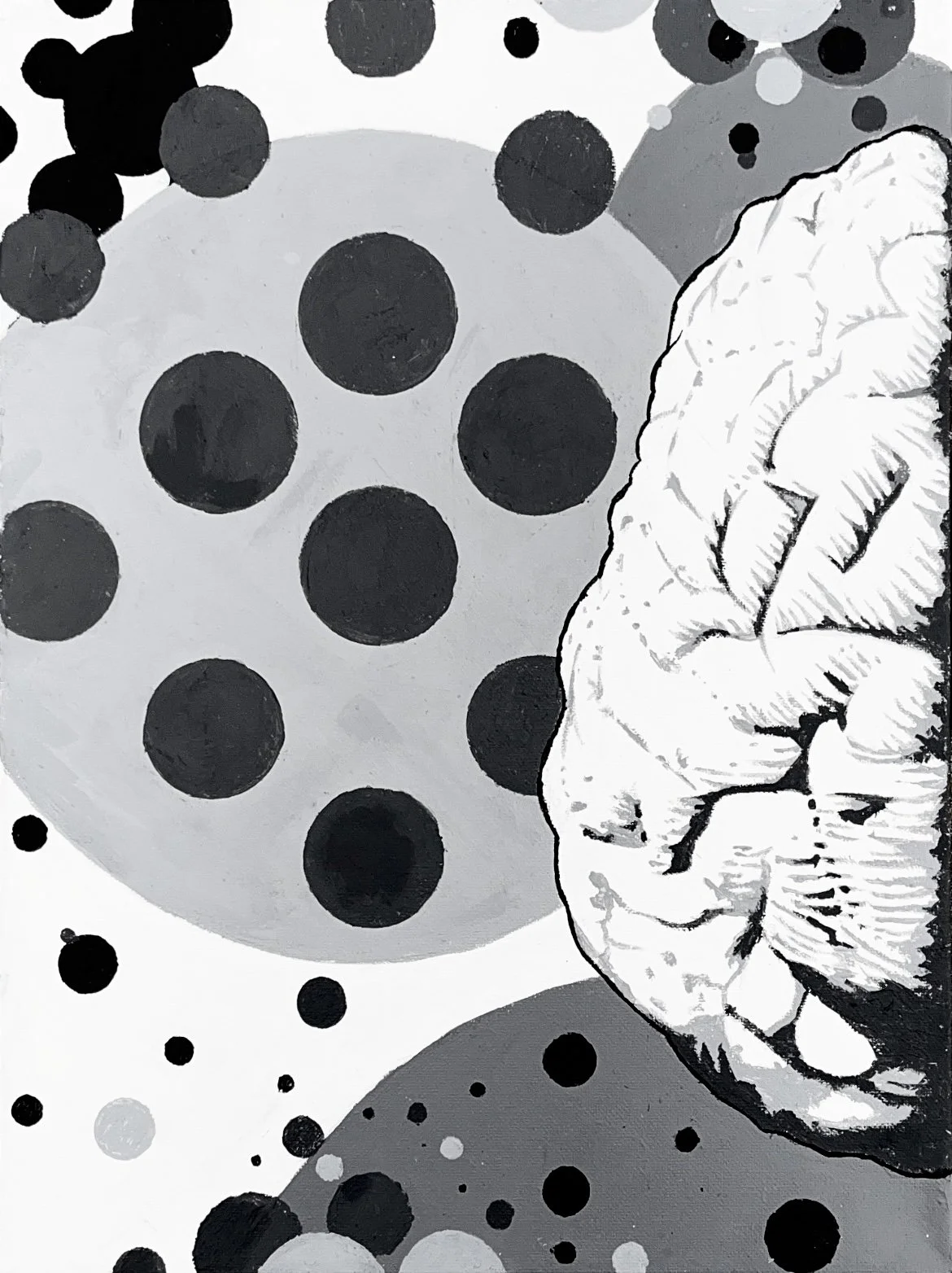
“L/R: L '' One half of a diptych depicting the left and right sides of a brain. According to a now disproved theory, the brain is split into left and right pieces, each responsible for different functions. The left brain is more logical and analytical, while the right brain is more creative and imaginative. For a time, it was thought that the thought processes of human beings could be attributed to more of a dominance from one particular side. For example, people who are left-brained theoretically have stronger skills in the field of mathematics and logic, while the right-brained tend to be more talented artistically. Again, this theory has been disproved, and studies have shown that certain brain activity is not unique to a right or left side. However, I still find the concept, especially when illustrated visually, to be very interesting. It's a concept similar to that of the yin and yang. I think most people have a bit of left and right brain in them, and it's the relationship between the two in one's own psyche that makes them who they are. I for one, feel that I am a more right-brained individual in that my thought processes are primarily driven by creative and imaginative forces. However, I absolutely feel that analysis and organization play a major factor in my ability to succeed in my pursuits. Essentially, I would not be able to imagine and create without being able to analyze and organize. The power of my right brain, regardless of its might, would be useless without the abilities given to me by my left brain. This painting depicts the left brain. It features clean lines and shapes to illustrate the systematic elements of the left brain. The crisp white background in addition to clearly defined lines and colors convey a sense of order and imply a very logical and thoroughly-planned design process. Its sharp and deliberate design serves as a stark contrast to the right brain. Acrylic on Canvas - 12 x 16 - 2021
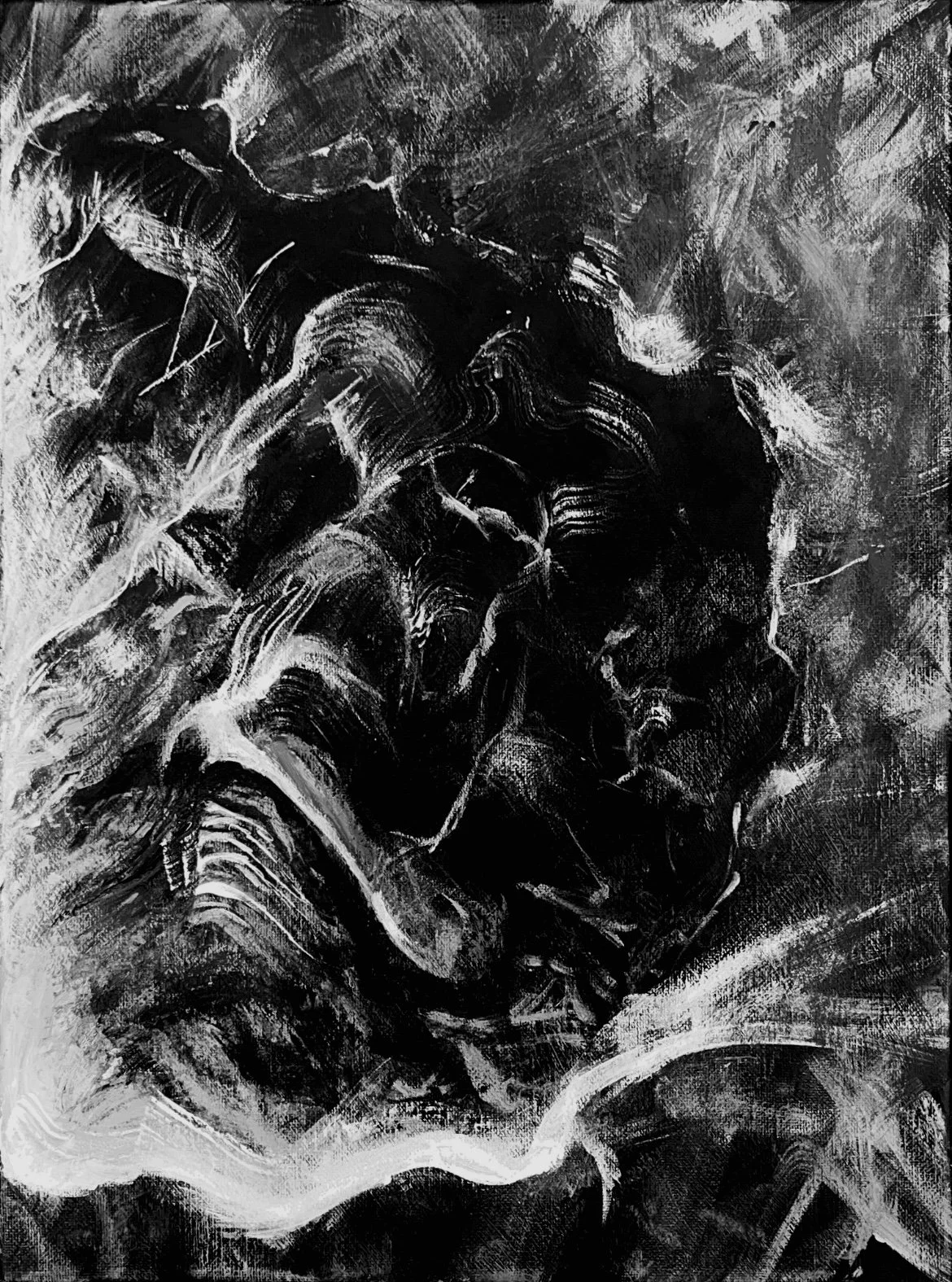
“L/R: R '' One half of a diptych depicting the left and right sides of a brain. According to a now disproved theory, the brain is split into left and right pieces, each responsible for different functions. The left brain is more logical and analytical, while the right brain is more creative and imaginative. For a time, it was thought that the thought processes of human beings could be attributed to more of a dominance from one particular side. For example, people who are left-brained theoretically have stronger skills in the field of mathematics and logic, while the right-brained tend to be more talented artistically. Again, this theory has been disproved, and studies have shown that certain brain activity is not unique to a right or left side. However, I still find the concept, especially when illustrated visually, to be very interesting. It's a concept similar to that of the yin and yang. I think most people have a bit of left and right brain in them, and it's the relationship between the two in one's own psyche that makes them who they are. I for one, feel that I am a more right-brained individual in that my thought processes are primarily driven by creative and imaginative forces. However, I absolutely feel that analysis and organization play a major factor in my ability to succeed in my pursuits. Essentially, I would not be able to imagine and create without being able to analyze and organize. The power of my right brain, regardless of its might, would be useless without the abilities given to me by my left brain. This painting depicts the right brain. Long, loose, flowing, splotchy, and random paint strokes fill the canvas to illustrate the abstract and chaotic nature of the right brain. The black canvas covered in dark grays is representative of an endless void. That darkness is interrupted by light gray and white streaks of paint representing the creative ideas infinitely occupying that void. Its messy and abstract design serves as a stark contrast to the left brain. - Acrylic on Canvas - 12 x 16 - 2021
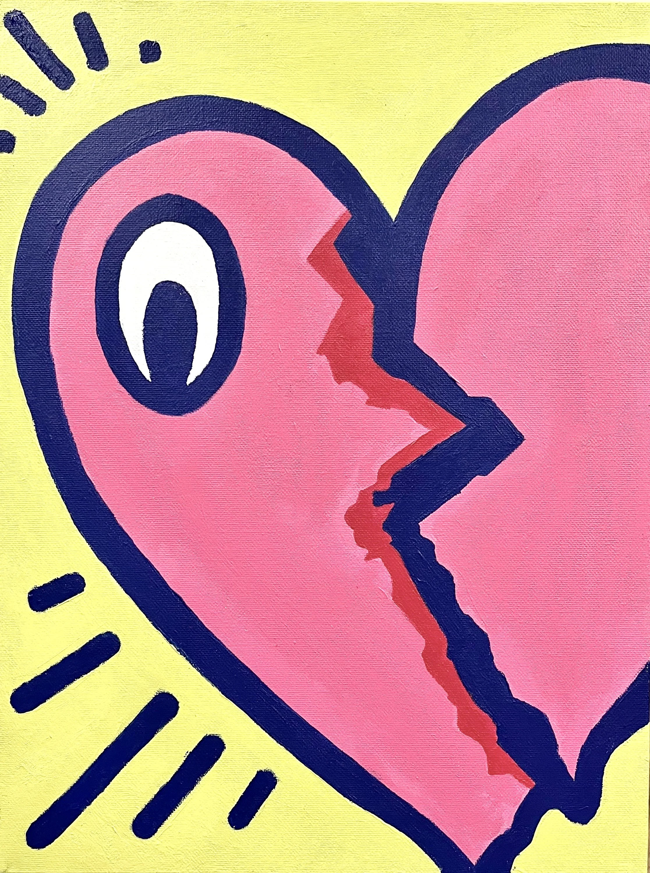
"Semi-Frozen Heartache" - The result of an experiment in color mixing and brush techniques. What started as an off-hand doodle of a Keith Haring-esque heart became a full fledged painting. I wanted to work with colors that were new to me, and challenge my skills with the brush by making my lines as clean as possible. I believe I accomplished both in this piece. - Acrylic on Canvas - 12 x 16 - 2021
“The Space In-Between” - A digital piece born out of a desire to capture the essence of a very strange lucid-dream that I had experienced. I used the totality of the knowledge that I had gathered about the procreate software, and combined all of my skills to create something that I felt was surreal enough to illustrate the dream. - Procreate for iPad Pro - 2021
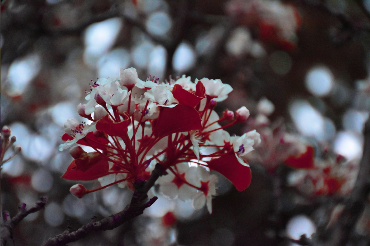
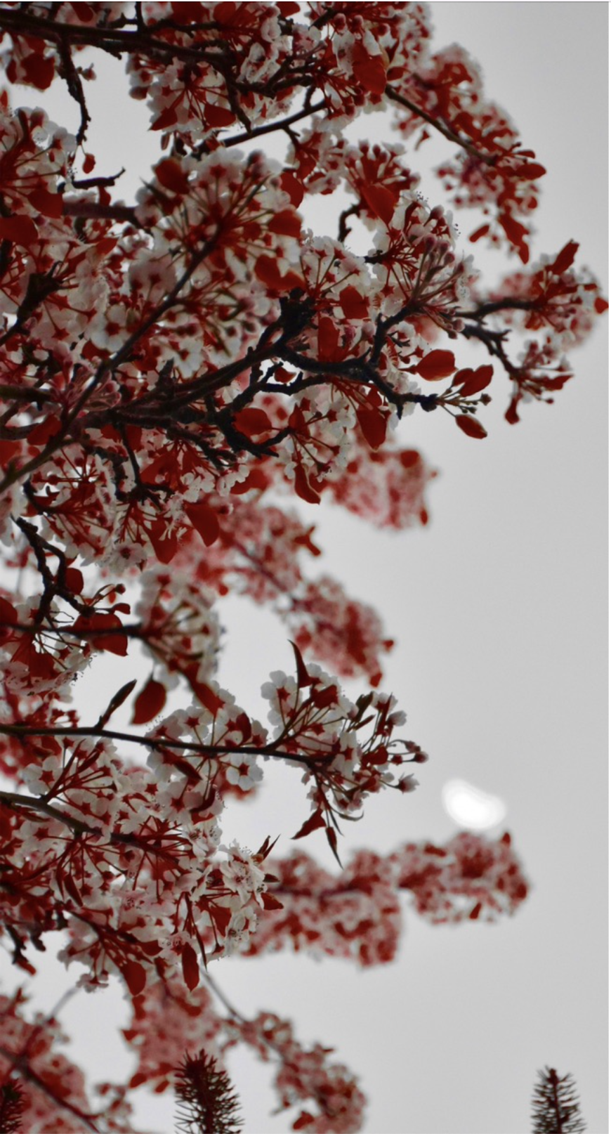
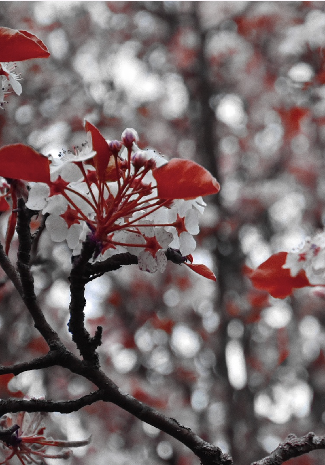
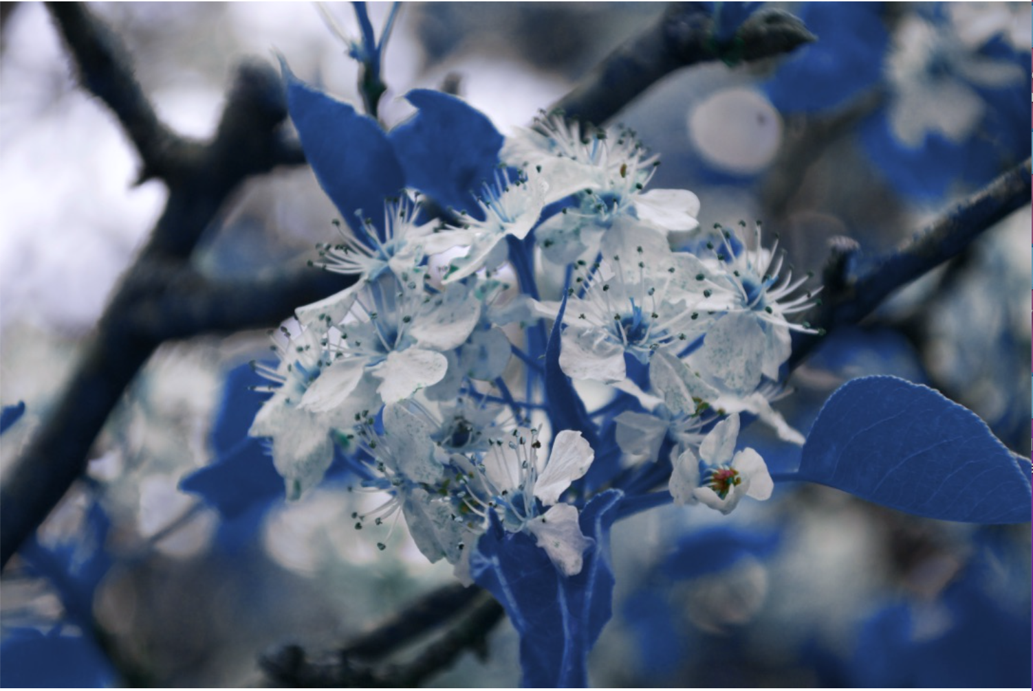
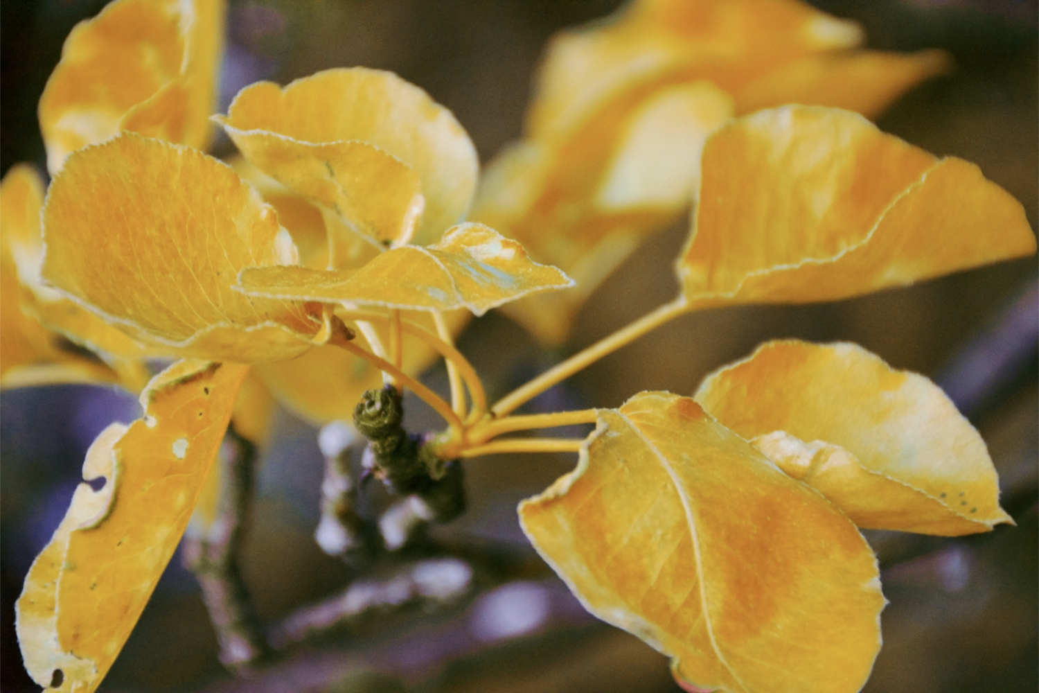
"Unnatural Color : Crimson 1" - A series of images created for the Photography 1 class that I took as a freshman at Butler University. This series of nine images originally depicted different flowers blooming on a tree with green leaves. However, the goal of this project was to remove green from the natural world, and instead replace it with the three primary colors. Though red, blue, and yellow can be found in nature quite frequently, I would argue that nature's primary color is actually green. I wanted to see what nature might look like if its primary colors were our primary colors. Therefore, I edited these nine photos in photoshop, removing the color green and instead creating red, blue, and yellow leaves. - Shot on a Nikon DSLR Camera and Edited in Photoshop - 2021
"Unnatural Color : Crimson 2" - A series of images created for the Photography 1 class that I took as a freshman at Butler University. This series of nine images originally depicted different flowers blooming on a tree with green leaves. However, the goal of this project was to remove green from the natural world, and instead replace it with the three primary colors. Though red, blue, and yellow can be found in nature quite frequently, I would argue that nature's primary color is actually green. I wanted to see what nature might look like if its primary colors were our primary colors. Therefore, I edited these nine photos in photoshop, removing the color green and instead creating red, blue, and yellow leaves. - Shot on a Nikon DSLR Camera and Edited in Photoshop - 2021
"Unnatural Color : Crimson 3 - A series of images created for the Photography 1 class that I took as a freshman at Butler University. This series of nine images originally depicted different flowers blooming on a tree with green leaves. However, the goal of this project was to remove green from the natural world, and instead replace it with the three primary colors. Though red, blue, and yellow can be found in nature quite frequently, I would argue that nature's primary color is actually green. I wanted to see what nature might look like if its primary colors were our primary colors. Therefore, I edited these nine photos in photoshop, removing the color green and instead creating red, blue, and yellow leaves. - Shot on a Nikon DSLR Camera and Edited in Photoshop - 2021
"Unnatural Color : Cobalt 1" - A series of images created for the Photography 1 class that I took as a freshman at Butler University. This series of nine images originally depicted different flowers blooming on a tree with green leaves. However, the goal of this project was to remove green from the natural world, and instead replace it with the three primary colors. Though red, blue, and yellow can be found in nature quite frequently, I would argue that nature's primary color is actually green. I wanted to see what nature might look like if its primary colors were our primary colors. Therefore, I edited these nine photos in photoshop, removing the color green and instead creating red, blue, and yellow leaves. - Shot on a Nikon DSLR Camera and Edited in Photoshop - 2021
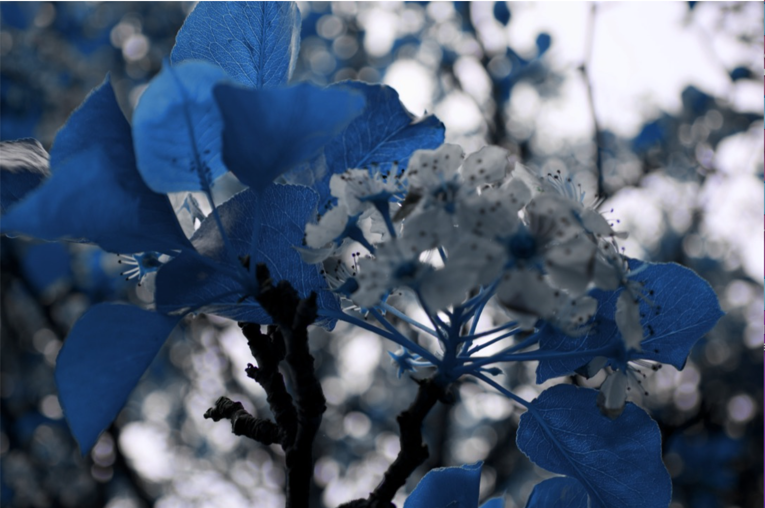
"Unnatural Color : Cobalt 2" - A series of images created for the Photography 1 class that I took as a freshman at Butler University. This series of nine images originally depicted different flowers blooming on a tree with green leaves. However, the goal of this project was to remove green from the natural world, and instead replace it with the three primary colors. Though red, blue, and yellow can be found in nature quite frequently, I would argue that nature's primary color is actually green. I wanted to see what nature might look like if its primary colors were our primary colors. Therefore, I edited these nine photos in photoshop, removing the color green and instead creating red, blue, and yellow leaves. - Shot on a Nikon DSLR Camera and Edited in Photoshop - 2021
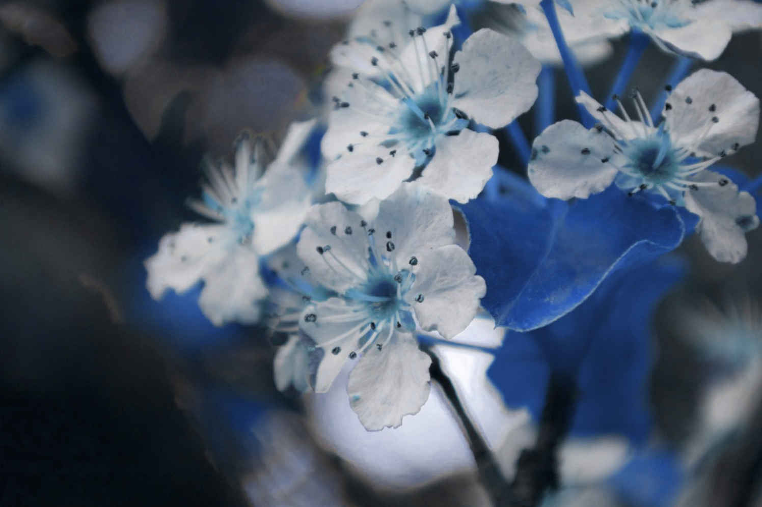
"Unnatural Color : Cobalt 3" - A series of images created for the Photography 1 class that I took as a freshman at Butler University. This series of nine images originally depicted different flowers blooming on a tree with green leaves. However, the goal of this project was to remove green from the natural world, and instead replace it with the three primary colors. Though red, blue, and yellow can be found in nature quite frequently, I would argue that nature's primary color is actually green. I wanted to see what nature might look like if its primary colors were our primary colors. Therefore, I edited these nine photos in photoshop, removing the color green and instead creating red, blue, and yellow leaves. - Shot on a Nikon DSLR Camera and Edited in Photoshop - 2021
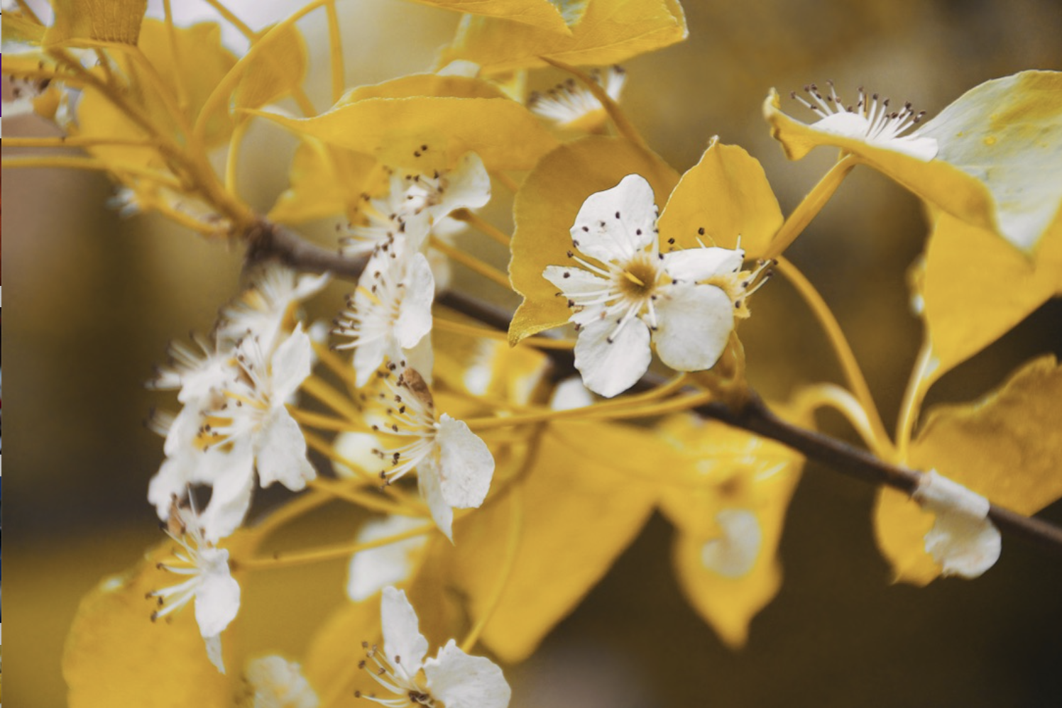
"Unnatural Color : Canary 1" - A series of images created for the Photography 1 class that I took as a freshman at Butler University. This series of nine images originally depicted different flowers blooming on a tree with green leaves. However, the goal of this project was to remove green from the natural world, and instead replace it with the three primary colors. Though red, blue, and yellow can be found in nature quite frequently, I would argue that nature's primary color is actually green. I wanted to see what nature might look like if its primary colors were our primary colors. Therefore, I edited these nine photos in photoshop, removing the color green and instead creating red, blue, and yellow leaves. - Shot on a Nikon DSLR Camera and Edited in Photoshop - 2021
"Unnatural Color : Canary 2" - A series of images created for the Photography 1 class that I took as a freshman at Butler University. This series of nine images originally depicted different flowers blooming on a tree with green leaves. However, the goal of this project was to remove green from the natural world, and instead replace it with the three primary colors. Though red, blue, and yellow can be found in nature quite frequently, I would argue that nature's primary color is actually green. I wanted to see what nature might look like if its primary colors were our primary colors. Therefore, I edited these nine photos in photoshop, removing the color green and instead creating red, blue, and yellow leaves. - Shot on a Nikon DSLR Camera and Edited in Photoshop - 2021
"Unnatural Color : Canary 3" - A series of images created for the Photography 1 class that I took as a freshman at Butler University. This series of nine images originally depicted different flowers blooming on a tree with green leaves. However, the goal of this project was to remove green from the natural world, and instead replace it with the three primary colors. Though red, blue, and yellow can be found in nature quite frequently, I would argue that nature's primary color is actually green. I wanted to see what nature might look like if its primary colors were our primary colors. Therefore, I edited these nine photos in photoshop, removing the color green and instead creating red, blue, and yellow leaves. - Shot on a Nikon DSLR Camera and Edited in Photoshop - 2021
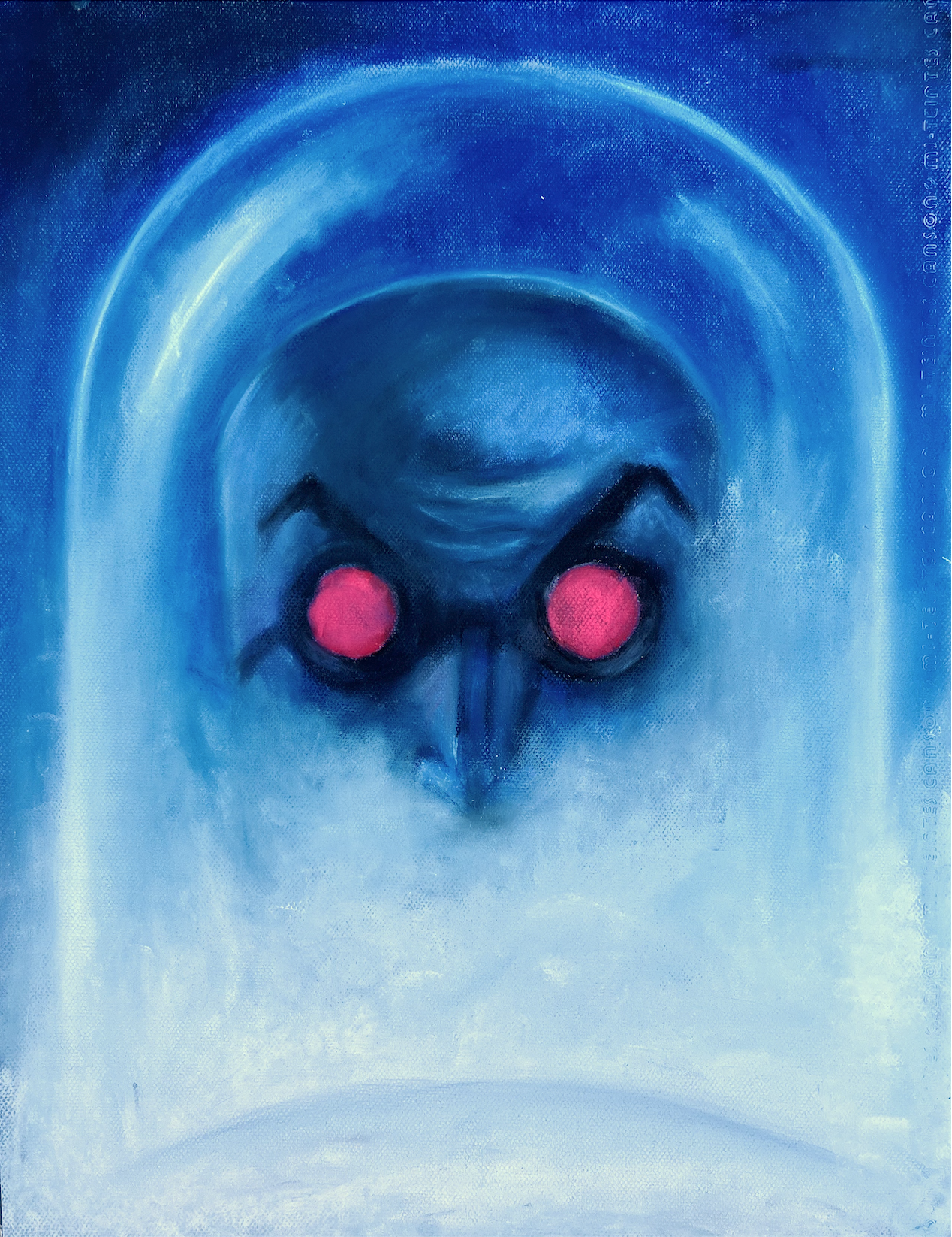
“Deep Freeze” - A portrait drawing of Batman villain Mister Freeze as he is depicted in Batman: The Animated Series. Mister Freeze is one of my favorite characters in all of fiction. I chose to draw him using pastel chalks so that I could capture the softness of the misty fog typically found in his laboratories, the icy frost often found lining his glass helmet, and the menacing red glow of his goggles. - Pastel on Paper - 2021 - 20 x 20.5
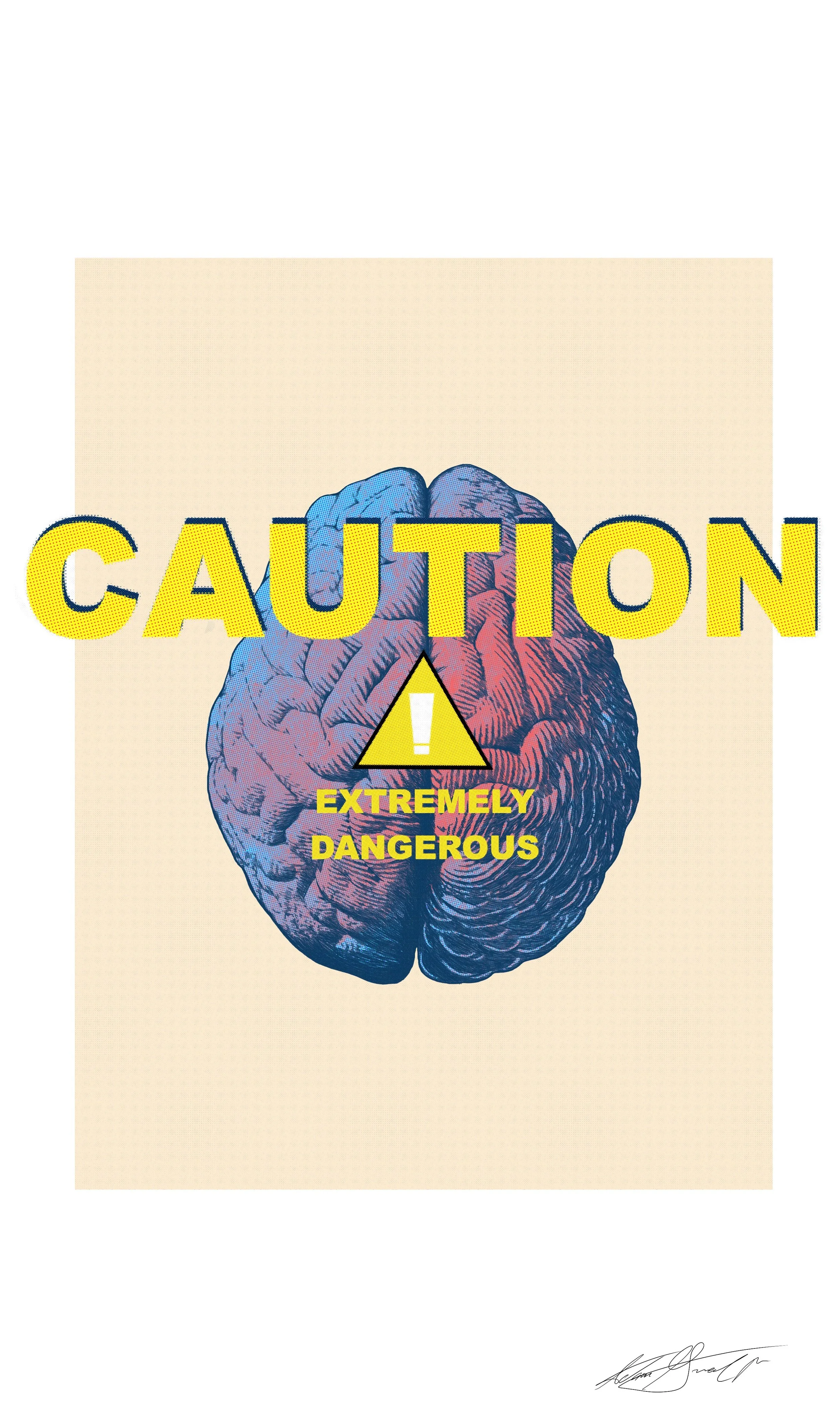
"CAUTION" - This digital poster is yet another result of experimentation in Procreate, and my attempt to combine different elements of design. Around this time, I spent a great deal of time on Pinetrest looking at and enjoying images of vintage medical charts and diagrams. Something about the warm tones, hand drawn diagrams, and halftones really connects with me. These design elements make me nostalgic for a period of time I never lived through; a time before technology streamlined everyday life; a time before the undo button; a time when things like medical diagrams had to be drawn by hand. Though the work was back-breaking (or moire accurately, hand-breaking), I was very satisfied with the hand-drawn inking look of the brain. I also enjoying experimenting with the halftone tool in Procreate to deliver the vintage look I was searching for. The message of the poster is yet another expression of my everyday struggles with the many issues I face as a result of my own brain chemistry. - Procreate for iPad Pro - 2021
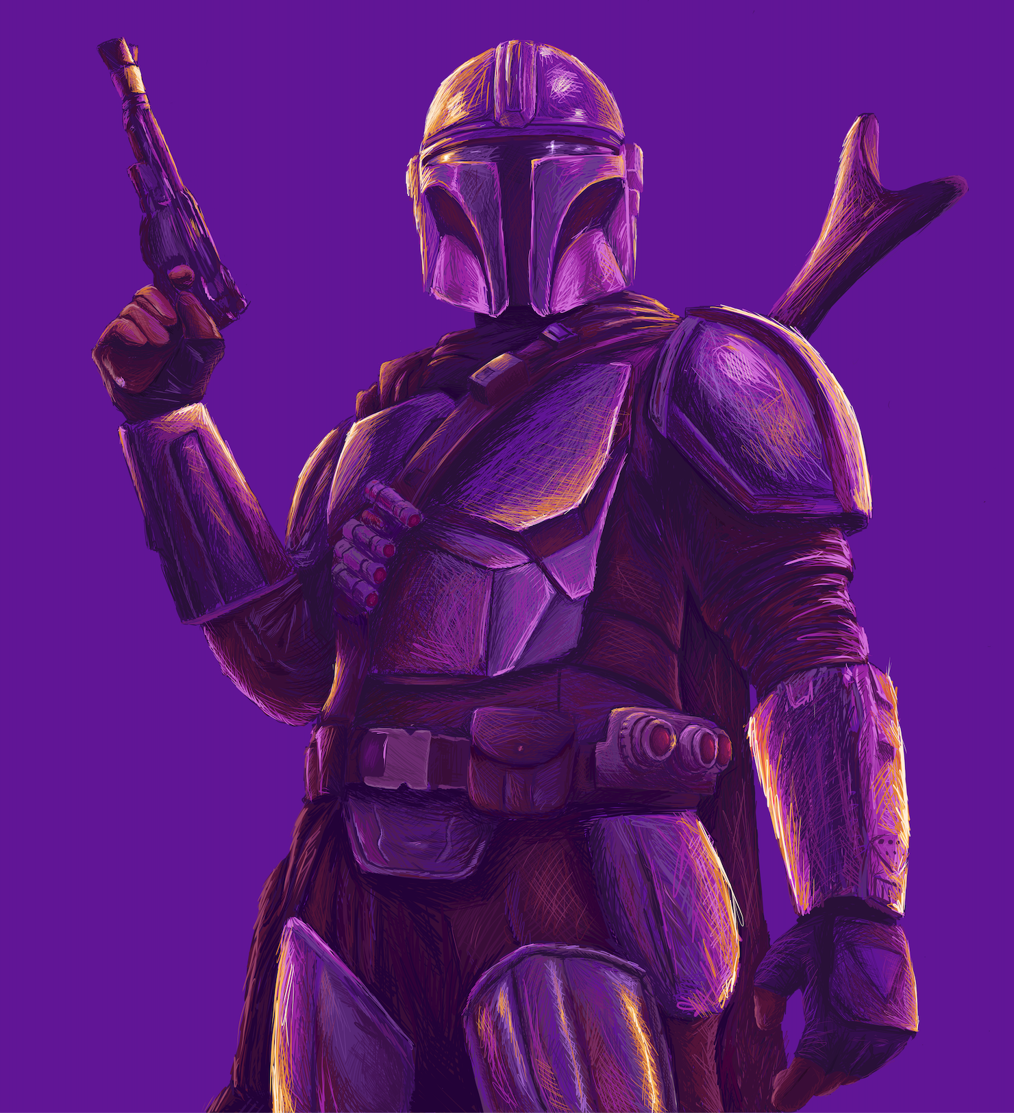
“Purple Reign” - A digital drawing of The Mandalorian born out of a desire to once again challenge myself with the digital medium. I wanted to create a digital drawing using techniques as if I was using ink markers and pens. Thus, I did not allow myself to erase any of my lines and forced myself to use only a single digital layer. Additionally, I wanted to use a different color palette. Rather than using different shades of all one color, I chose to make my midtones, shadows, and highlights different (but complimentary) colors. The result is - in my opinion - a beautifully messy depiction of one of my favorite Star Wars characters. - Procreate for iPad Pro - 2021
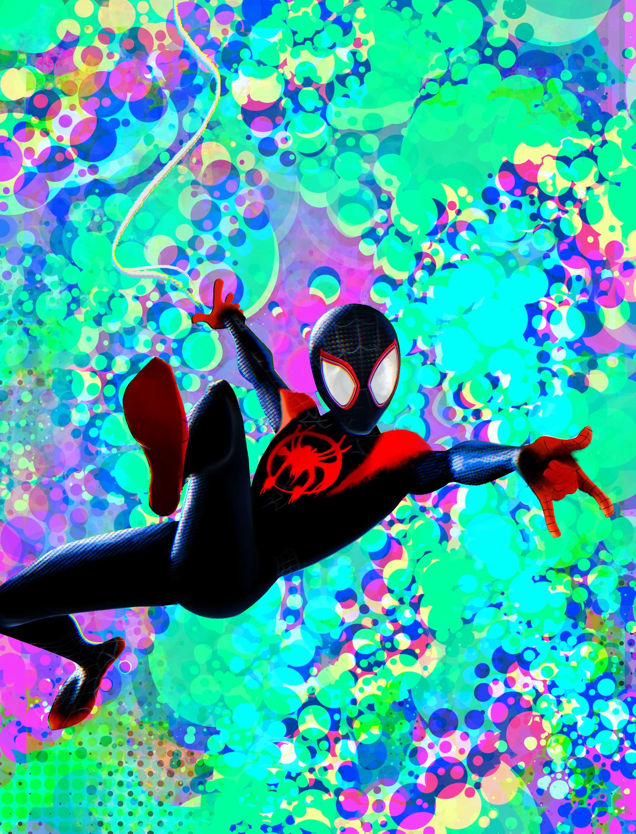
"Experiment: M42" - An attempt to mimic the beautifully-distinct art style of the animated film "Spider-Man: Into the Spider-verse" in a digital drawing of the film's main character, Miles Morales. Among many of the bold and impactful stylistic choices made by the film's creators were their heavy use of halftones. Halftone shading, a technique prominent in the very early days of comic books, is a constant in every single frame of the 117 minute film. The result made for one of the most visually stunning films in the history of cinema. I would describe the experience of watching "Into The Spiderverse” as baring witness to a living, breathing, moving version of a Spider-Man comic-book in the purest and most literal sense. Additionally, the inclusion of some sort of chromatic aberration effect in every frame not only adds even more to the fresh and unique look delivered by the creators, but serves a narrative purpose as well. Nowadays, audiences have become more familiar with the concept of a multiverse, and the existence of parallel versions of their favorite characters from alternate universes. However, in 2018, “Into the Spiderverse” had the difficult task of introducing the multiverse, as well as getting audiences to accept it. Regardless of the fact that the film’s narrative was strong enough to achieve this feat on its own, the visuals of the film contribute to that goal as well. One of the more subtle ways it displays the idea of the multiverse to the audience is through the inclusion of a slight chromatic aberration effect in every frame. The effect, also known as color fringing, abstracts and distorts reality and bleeds color ever so slightly past the outlines of objects. As stunning and unique as it looks in motion, in any other context it would be a very noticeable imperfection. However, in the case of this film, the color fringing is a very purposeful inclusion. An imperfection like color fringing serves as an indicator to the audience that despite the appearance of normalcy, something is off. Its difficult to ignore the color fringing, and its difficult to ignore the feeling that something about this story is different. It is then revealed through various story beats that something is in fact off, and the story takes place in a distinctly different universe than that of a traditional Spider-Man story. Additionally, the color fringing returns even more noticeably whenever the concept of the multiverse is the central focus. Details like these are among the many reasons this movie (and its sequel “Across The Spiderverse") inspire me as an artist. I thoroughly enjoyed using the various tools offered in Procreate to recreate the look of the film. - Procreate for iPad Pro - 2021
"The Cold" - A portrait of Darth Vader as he is depicted in the animated televison series "Star Wars : Rebels." This drawing was completed as an assignemnt for the Drawing 1 course thatv I took as a freshman at Butler University. Students were required to create a drawing of their choice on black paper with black and white colored pencils. These requirements forced my classmates and I to think about value in a different context. However, I was uniquely able to draw from knowledge and experience I had aquired though similar assignremtns I had completed in high school. Therefore, due to my familiarity with this reverse-value concept, I felt it necessary to challenge myself. Though Darth Vader might very well be my favorite character in all of fiction, I had always found him very difficult to accurately render. However, that day I decided that this was a mountain I was going to summit. For reference, I chose an image of the very stylized depcition of the character in the animated television series "Star Wars: Rebels." While it doesn't quite eclipse the beauty of the original Darth Vader helmet design that is featured in the live-action films, I still absolutely love the design featured in "Rebels." This particular design is meant to pay homage the initial concept art created by artist Ralph McQuarry in 1977 for the original "Star Wars" movie. Ultimately, I am still very pleased with how this drawing turned out. Not only do I feel I was able to accurately draw one of my favorite characters of all time, but I also feel like I reached a new height in terms of my ability to make photo-realistic drawings. - Black and White Colored Pencil on Black Paper - 9 x 12 - 2020
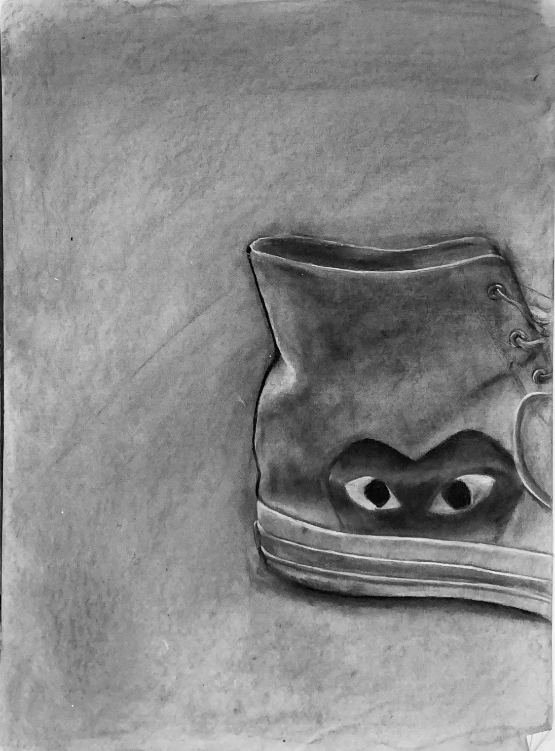
"CDG Chuck Taylor" - A still life featuring the right shoe of my personal pair of Comme des Garçons Converse Chuck Taylors. This was a drawing that was completed for an assignment in the Drawing 1 class that I took during the first semester of my freshman year at Butler University. The assignment required students to choose a single item and create a still-life drawing of it using charcoal. I decided to keep it simple and draw one of the shoes that I was wearing at the time. Among others that I created around that time, this drawing was emblematic of a new height that I hd reached in terms of my drawing skills. In the past, I struggled with my own tendency to make marks that were too strong, and difficult to impossible to erase. However, during the making of this drawing, I was able to overcome this bad habit, and I believe that the result is some of my finest work yet. - Charcoal on Paper - 18 x 24 - 2020
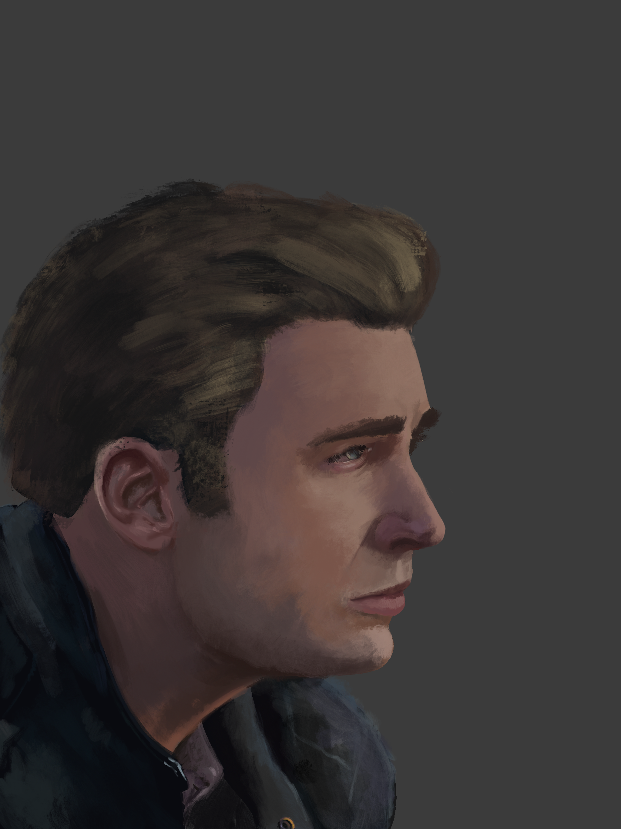
"Sad Steve" - A digital painting of Steve Rogers aka Captain America from the 2019 film "Avengers: Endgame." I have long been a collector of the concept art books that accompany my favorite films. Around this time I was on a particularly intense Marvel kick following the release of "Endgame," and was feeling an even greater sense of admiration for the incredible work done by Marvel Studios concept artists Ryan Meinerding and Andy Park. The two of them (among many other collaborators) are responsible for creating many of the most iconic character designs of the last decade and a half. Furthermore, they delivered those designs in the form of absolutely breathtaking digital paintings, which I absolutely adore. This digital painting of Steve Rogers during a somber moment in the film was my first attempt to replicate the style of their work. - Procreate for iPad Pro - 2019
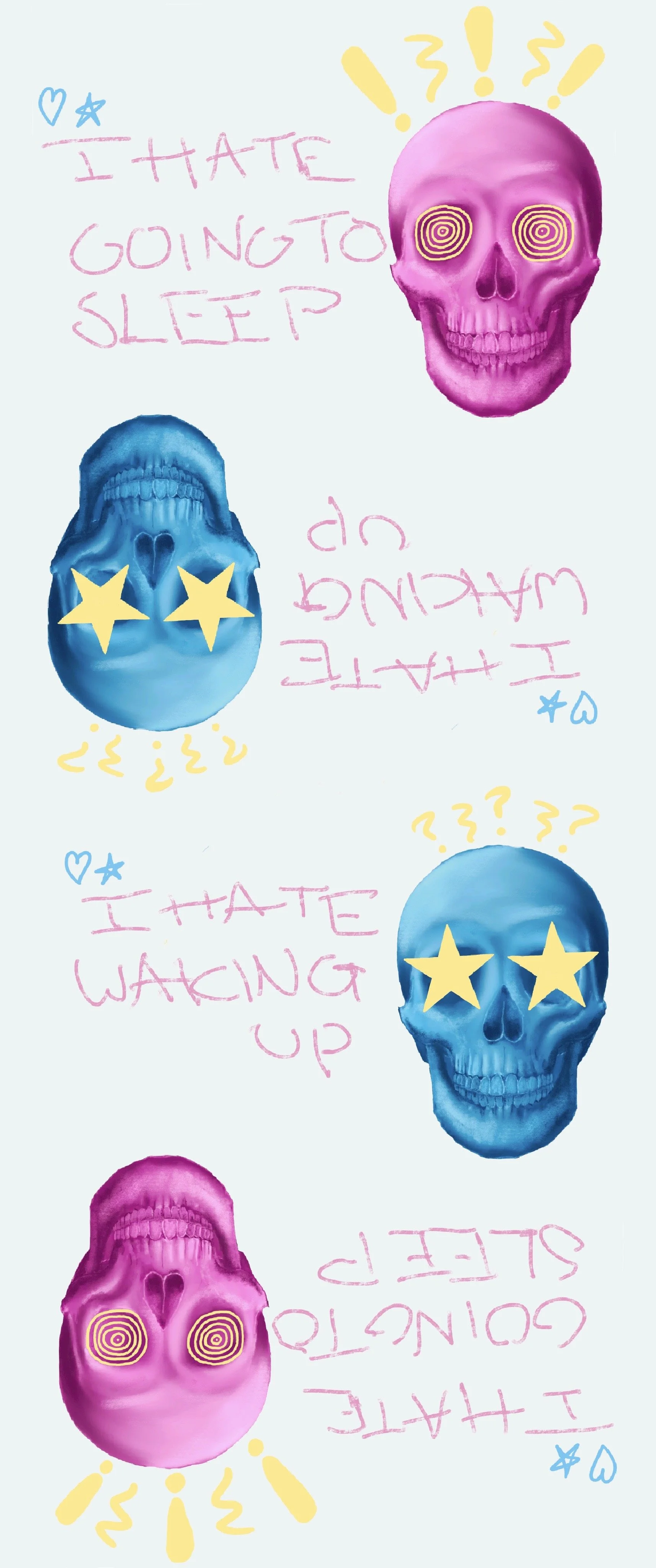
"I HATE GOING TO SLEEP/I HATE WAKING UP" - This digital piece originally began as nothing more than a doodle. Out of boredom, I was experimenting with a digital drawing of a skull that I had made weeks earlier. I liked the idea of adding more graphic elements to a more photorealistic image, and I was enjoying the aesthetic and concept that was beginning to take shape. Additionally, this piece was made during an especially strenious period of my life, specifically during the peak of my college application proccess during the fall of my senior year of high school. Pent up stress and anxiety seemed to allow me to express myself much more easily than in past attempts. The result not only delivers an aesthetiuc that I find visually interesting, but also provides insight into my own perdspective on living with ADHD. The message of "I HATE GOING TO SLEEP/I HATE WAKING UP," I feel is a perfect description of the relationship I have with sleep as a result of my condition. Due to the way that my brain operates as well as the effects of the medication I take to treat my ADHD, sleep has been a struggle of mine for as long as I can rememeber. Regardless of how tired my mind and my body are, most nights I often have serious trouble quieting my mind. The process of getting my brain to shut down requires complicated methods as well as a decent amount of time. The process, is for lack of better words, annoying. This is further ampligfied by the fact as tired as I may be, my brain does not actually want to sleep, and instead continue searching for dopamine responses wherever it can find them. To be slightly more specific, I hate the action of going to sleep. However, there are few things I enjoy more in life than the action of actually sleeping. Not many things in my life can quite eclipse the feeling of overcoming the obstacles laid out for me, and giving my body and mind some much needed rest. I think most people can agree, sleep feels amazing. Additionally, I have seemingly always had the unique ability to lucid dream. Thus, sleep not only allows me rest from the mental and physical stress of everyday life, but it also allows me to quite literally create and exist in a reality of my choosing. Therefore, the sound of my alarm blaring in the morning is not something I enjoy. That noise signifies a violent end to bliss, and a sharp return to reality. In other words, I hate waking up. As the day goes on, and my brain continues to acquiesce to reality, I get more comfortable and the demand for dopamine increases. By the end of the day, once again, my brain wants nothing more to stay wake, leading to more distain for the action of going to sleep. This cycle repeats itself everyday. This is life with ADHD, and I feel that this piece delivers that message exactly the way I want it to. - Procreate for iPad Pro - 2019
“Six Elements of Design Project (1 of 6) ” - A project completed for a Graphic Design 1 class that I took as a senior at Staples High School. The project required students to create six different images in Adobe Photoshop that each represent one of the six elements of design. This image represents the element of shape. - Adobe Photoshop - 2019
“Six Elements of Design Project (2 of 6)” - A project completed for a Graphic Design 1 class that I took as a senior at Staples High School. The project required students to create six different images in Adobe Photoshop that each represent one of the six elements of design. This image represents the element of value. - Adobe Photoshop - 2019
“Six Elements of Design Project (3 of 6)” - A project completed for a Graphic Design 1 class that I took as a senior at Staples High School. The project required students to create six different images in Adobe Photoshop that each represent one of the six elements of design. This image represents the element of color. - Adobe Photoshop - 2019
“Six Elements of Design Project (4 of 6)” - A project completed for a Graphic Design 1 class that I took as a senior at Staples High School. The project required students to create six different images in Adobe Photoshop that each represent one of the six elements of design. This image represents the element of line. - Adobe Photoshop - 2019
“Six Elements of Design Project (5 of 6)” - A project completed for a Graphic Design 1 class that I took as a senior at Staples High School. The project required students to create six different images in Adobe Photoshop that each represent one of the six elements of design. This image represents the element of texture. - Adobe Photoshop - 2019
“Six Elements of Design Project (6 of 6)” - A project completed for a Graphic Design 1 class that I took as a senior at Staples High School. The project required students to create six different images in Adobe Photoshop that each represent one of the six elements of design. This image represents the element of form. - Adobe Photoshop - 2019
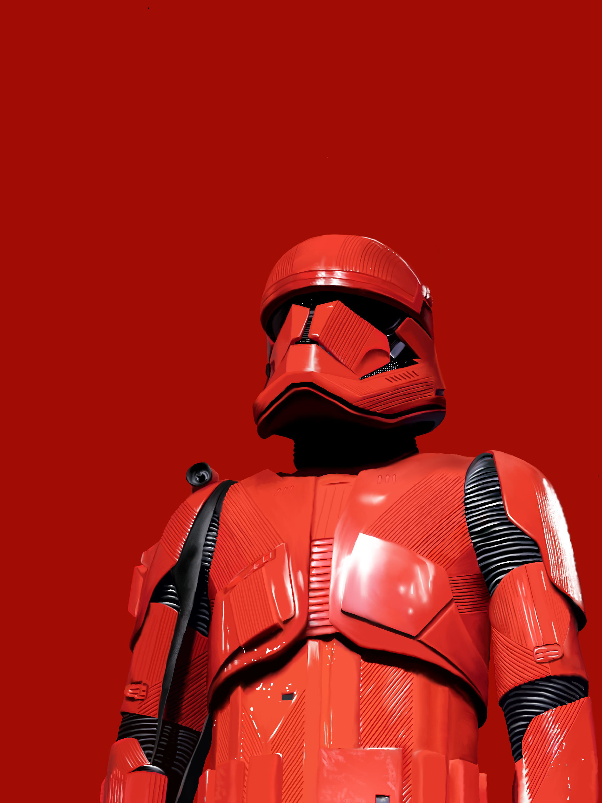
"Red Storm" - A digital drawing of a Sith trooper featured in the 2019 film, "Star Wars Episode IX: The Rise of Skywalker." As is typical for me, I found the design of the Sith Trooper incredibly intersteing, and decided to make a drawing of one. However, this time I decided to attempt this digitslly. This piece was a major step up in terms of my skills with digital art, as I had been experimnenting with the medium for almost a year at that point. Though it was still fairly new, I was begining to improve quite a bit. Whereas I had previously exclusively been making more graphic digital art, it around this time that I had begun attempting to apply my skills and techniques in traditional mediums to the digital format. The result was a way to create photorealistic pieces that I hadn't imagined I was capable of yet. - Procreate for iPad Pro - 2019
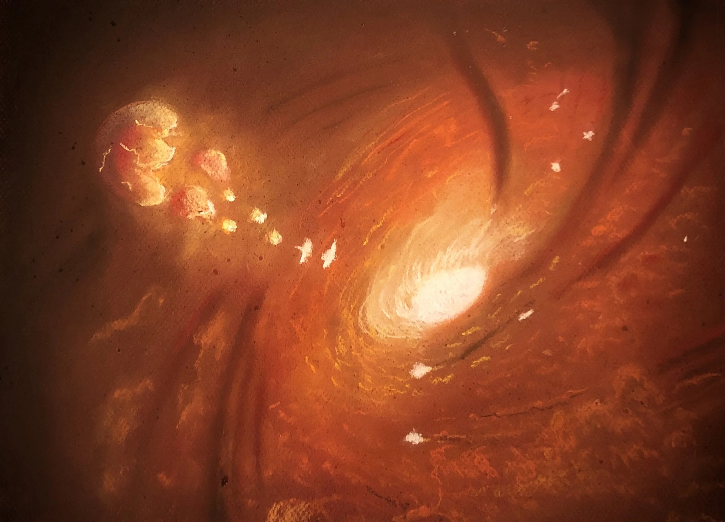
"Space Series : Gravity Well" - One part of a semester long assignment in the AP Studio Art class that I took as a junior at Staples High School. Students were required to create a series of several different pieces that related to the same subject matter, for which I chose outer space. For this piece I chose to draw a gravity well, a phenomenon similar to a black hole. Here a gravity well is depicted as a giant swirling hole in space that is sucking in everything remotely close to it. The look I was going for was largely inspired by the depiction of a gravity well in the movie "Solo: A Star Wars Story" (2018). The existence of events such as gravity wells is a truly horrifying reality. It is difficult to wrap ones head around the fact there are things out in the universe that simply end anything that falls within their range, and even worse. However, every-time a black hole or a gravity well is depicted in media, rendered by scientists, or even captured in real life, the result is undeniably a beautiful one. I chose to make this drawing and include it in my space series to illustrate both the horror and beauty of nature. I wanted to create the same sense of conflict in the viewer that I have when I imagine a black hole. I wanted them to stare in awe of its appearance, and then shudder at the reality of its purpose. - Pastel on Paper - 11 x 14 - 2019
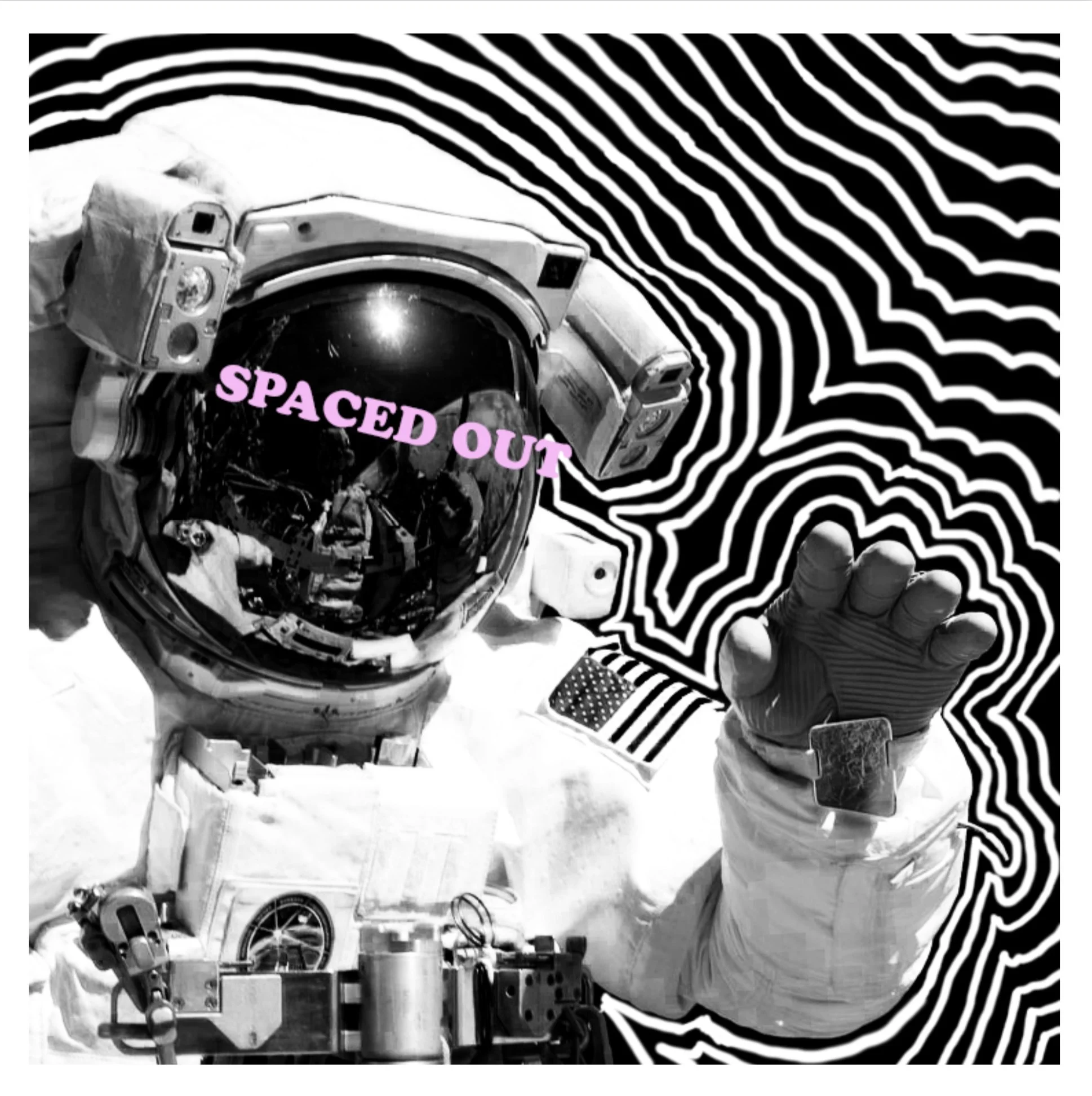
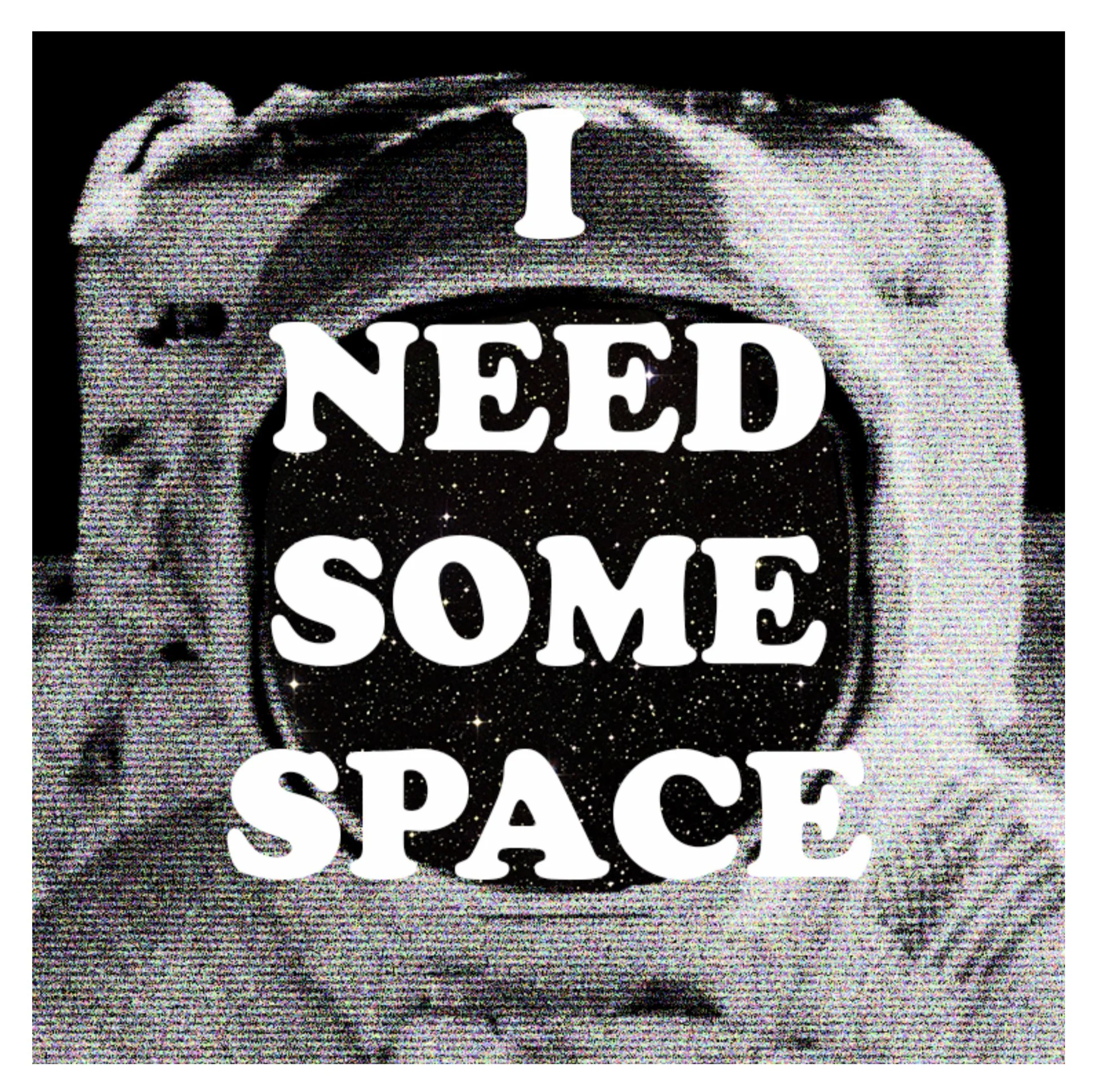
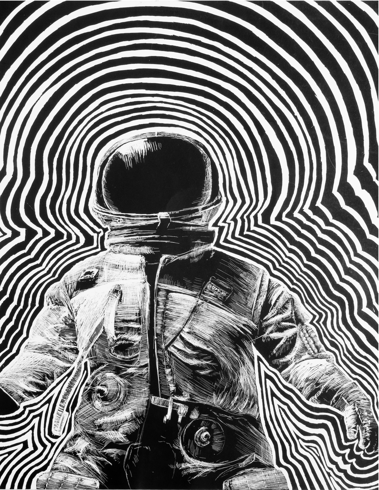
"Space Series : Wavelengths" - One part of a semester long assignment in the AP Studio Art class that I took as a junior at Staples High School. Students were required to create a series of several different pieces that related to the same subject matter, for which I chose outer space. This scratchboard drawing depicts an astronaut drifting through space. Additionally, the outline of the astronaut's body is replicated and repeats as it expands to the edges of the page. This was a choice I made primarily because I really loved how it looked. However, I also wanted to create a scene in which waves of energy are radiating from astronaut. As they drift through the emptiness of space, their spirit reaches out to the abyss from within them, searching for a response. These waves represent the notion that, human beings will always try to fill voids, and connect to anything that they can, regardless of if they are even consious of it. - Scratchboard - 11 x 14 - 2019
"Space Series : Dead Space" - One part of a semester long assignment in the AP Studio Art class that I took as a junior at Staples High School. Students were required to create a series of several different pieces that related to the same subject matter, for which I chose outer space. For this drawing I chose to draw a portrait of a skull inside of an astronaut suit. While I am truly fascinated by the wonders of space, I wanted to illustrate the more grim elements with this drawing. - Pastel on Paper - 11 - 14 - 2019
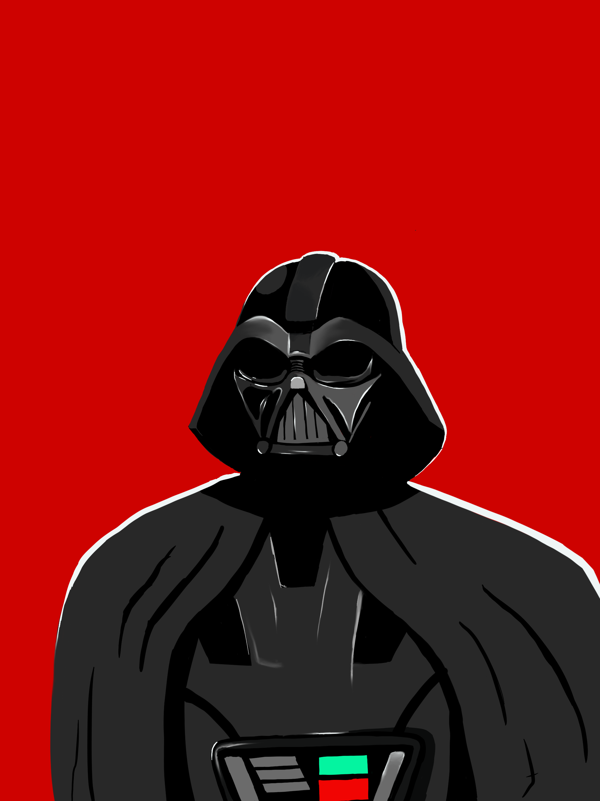
"Vader" - A digital drawing depicting a stylized version of Darth Vader. After recieving an iPad Pro and an Apple Pencil for my birthday, this was the very first digital drawing that I had ever made. I still hold this drawing near to my heart, as it represents the beginning of a completely new era of my creative journey. Access to these new tools and resources meant access to what felt like infinite new possibilities to create art. In those first few months I spent hours at a time experimenting with the different brushes, tools, and other features. I was making drawings like this one that were much more graphic and stylized than I ever had before. As my exploration continued, my abilites would expand and my limits would fade. - Procreate for iPad Pro - 2019
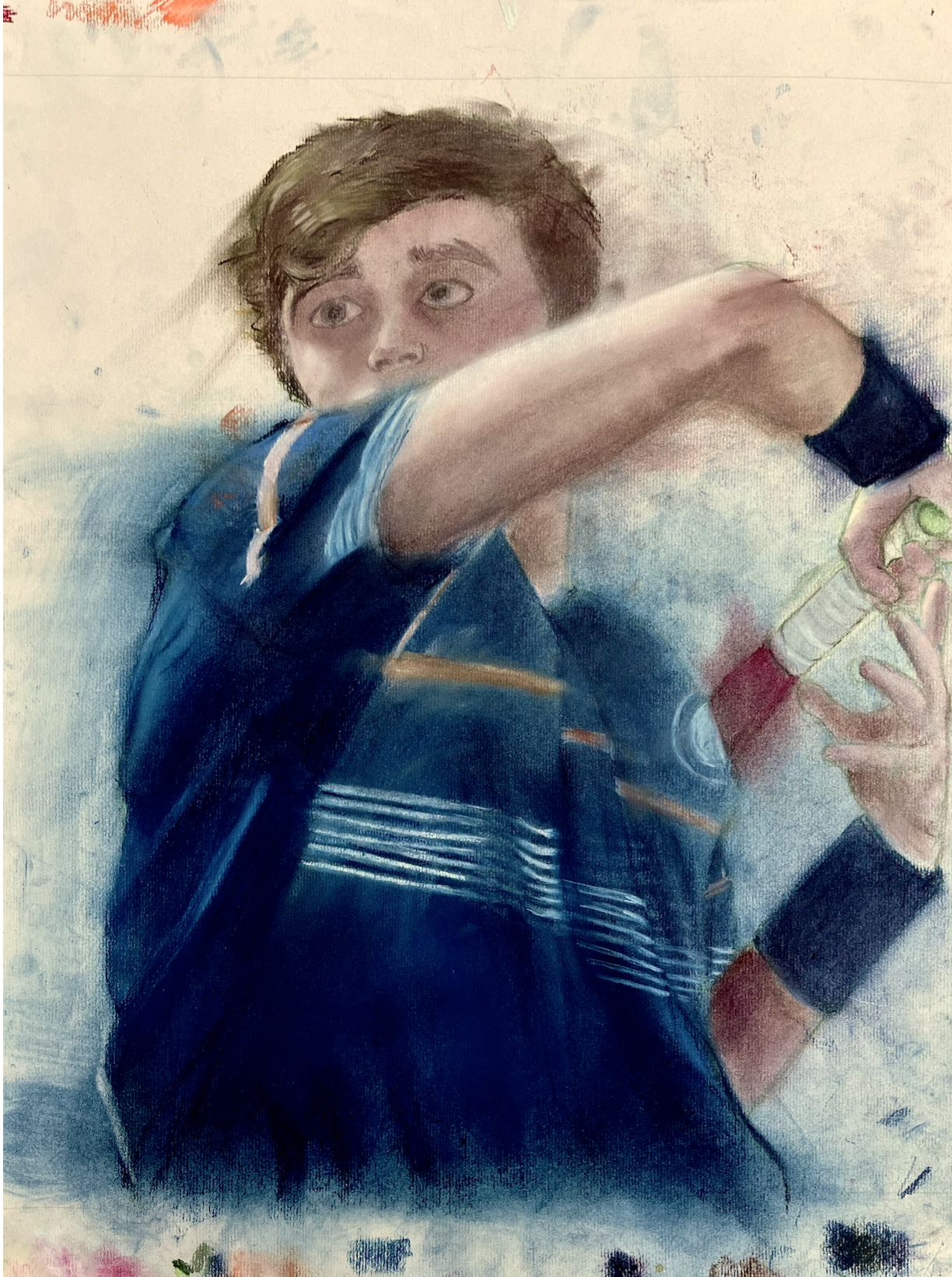
"Self Portrait 2019" - An assignment from the AP Studio Art Class that I took as a junior at Staples High School. The latter half of the AP Studio Art course was much less rigid in terms of requirements. Assignments became much more vague, forcing us to develop projects on our own and as a result, begin to define each our unique styles. The only guideline we had to follow for this project was that it had to be a self portrait. I chose to render a picture of myself playing tennis using pastel. My intention was for the drawing to be slightly messier, and for the colors to flow beyond the boundaries of the subject to create the appearance of some kind of motion blur. - Pastel on Paper - 18- 24 - 2019
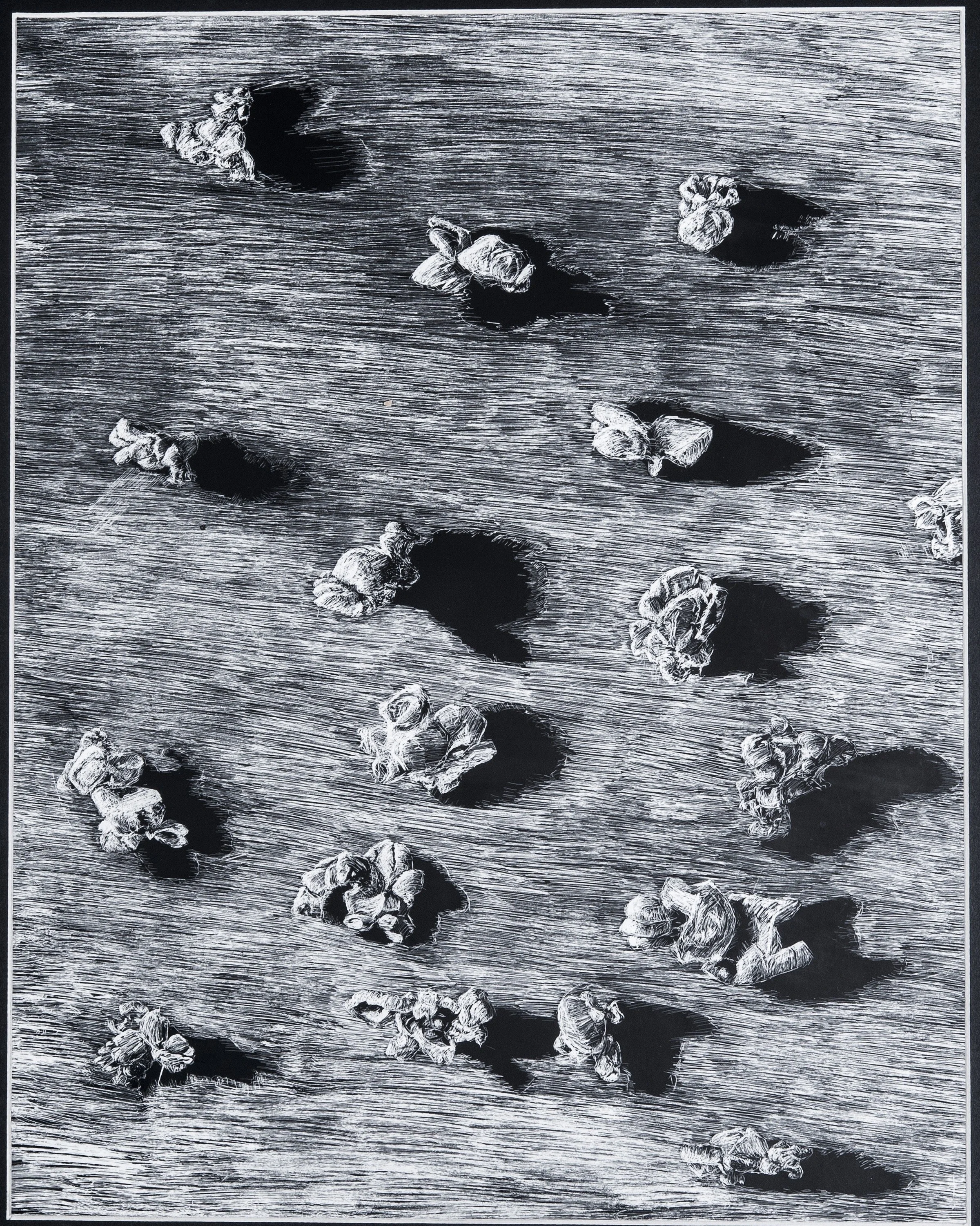
"Popcorn Still Life" - An assignment from the AP Studio Art class that I took as a junior at Staples High School. Students were required to render a still life consisting of scattered pieces of popcorn glued to a black surface. We were also required to complete the assignment with a scratch board and various scratching tools. Our teacher chose scratchboard as the mandatory medium to challenge our understading of value by in a sense inverting light and dark. Instead of adding value to a valueless page, we had to subtract value from a page that was nothing but. Additionally, the medium forced us to be much more precise and thoughtful with our strokes which, in hindsight, seems to have been an overarching theme of the entire course. Each mark made on the black surface of the scratch board reveals the right white film hidden underneath. The heavier the mark is, the brighter. Thus, in order to achieve different values to accurately render the nuanced highlights and shadows of the still life, extremely delicate and precise strokes are required. - Scratchboard - 10.5 x 13.5 - 2018
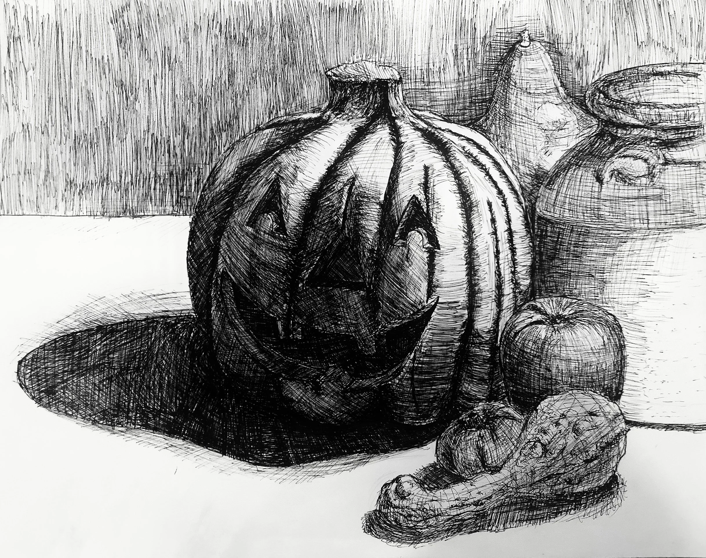
"Seasonal Still Life" - An assignment from the AP Studio Art class that I took as a junior at Staples High School. Students were required to render a still life featuring several fall themed items only using micron pens. This assignment was the culmination of several weeks of study on different shading techniques. Among these techniques were hatching, cross-hatching, stippling, and scribbling. This was the first time I had ever truly dared to use ink in my art. Though it is undeniably rough-around its edges, I still view this piece as another turning point in my journey as an artist. - Ink on Paper - 11 x 14 - 2018
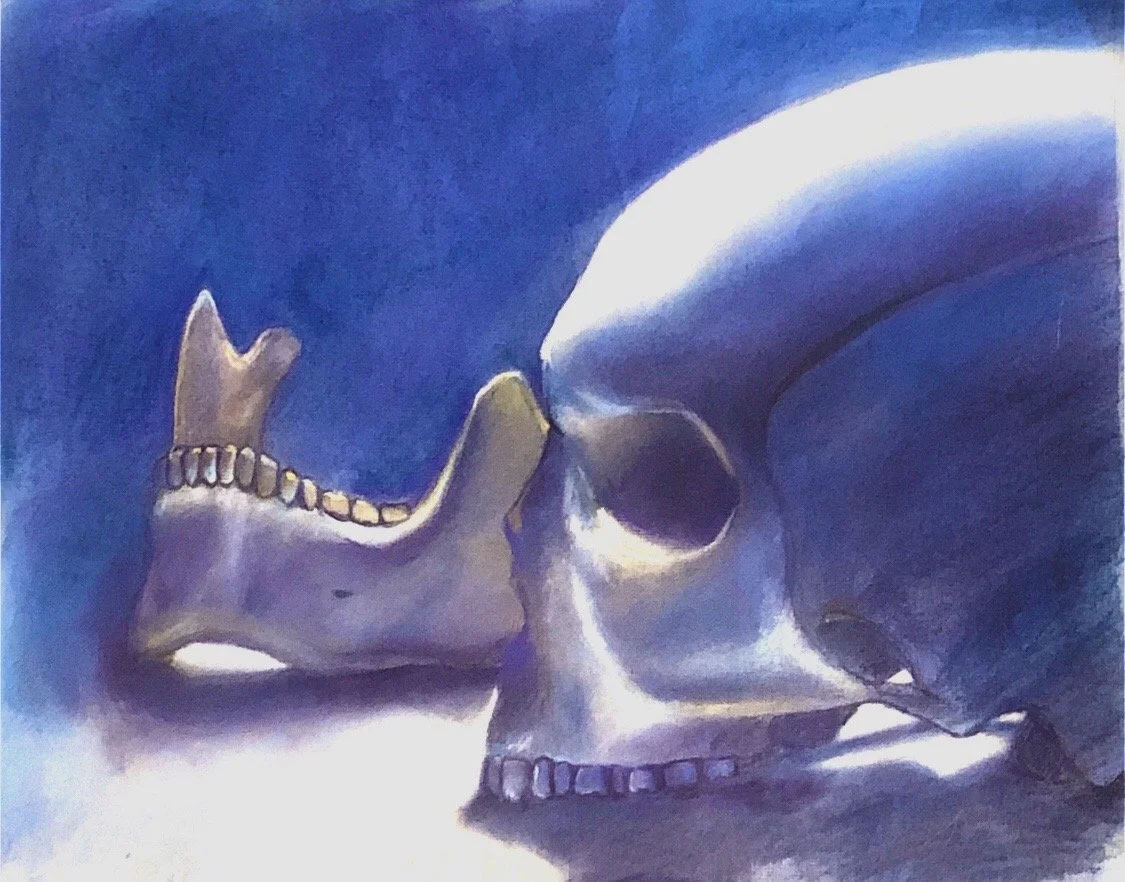
"Skull Still Life" - An assignment from the Honors Drawing course that I took as a sophomore at Staples High School. The exercise required students to render a still life of a plastic skeleton. I sat within view of the skull and the jaw. We were free to choose from several different mediums to utilize, and I chose to make my drawing in pastel. I did this continue challenging myself to create value with color. - Pastel on Paper - 16 x 20 - 2018
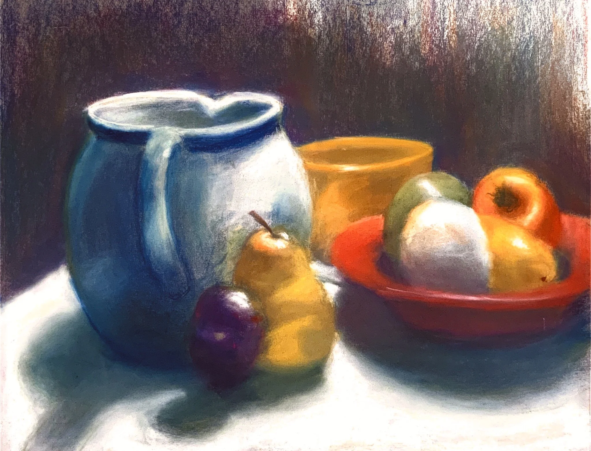
"Still Life" - An assignment from the Advanced Drawing 2 course that I took as a sophomore at Staples High School. The exercise required students to render a still life in pastel chalks that featured several colorful dishes and plastic fruits. The catch was that we were not permitted to use the color black in any capacity. My classmates and I were required to create value using color. In order to accomplish this, I had to intensely study the the extremely subtle nuances in the color of the different objects, and to look at color in a way that I never had before. I learned a great deal making this piece, and though my skills have grown far beyond what they were at the time of its creation, I still view it as a milestone in my artistic journey. - Pastel on Paper - 16 x 20 - 2017
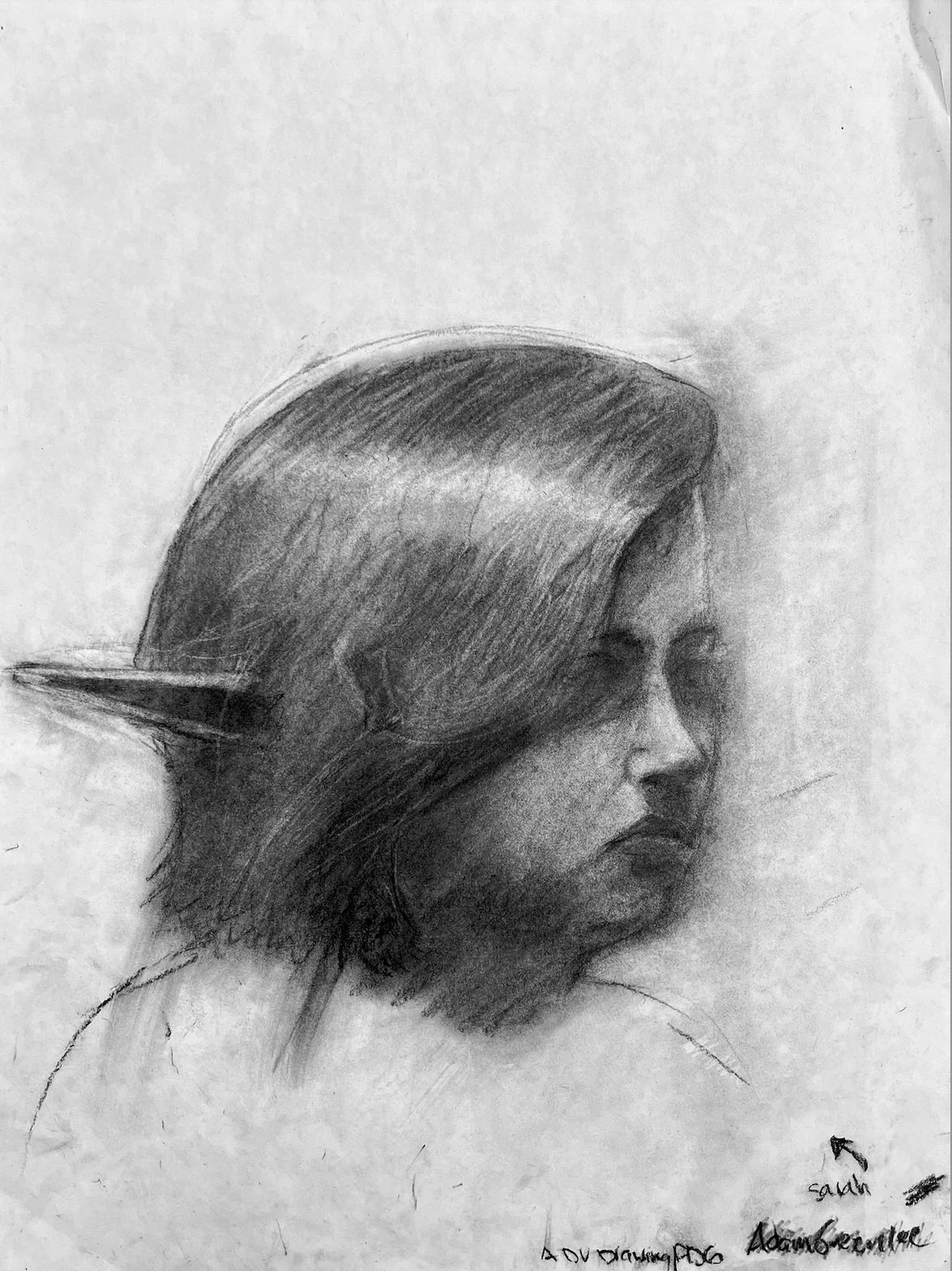
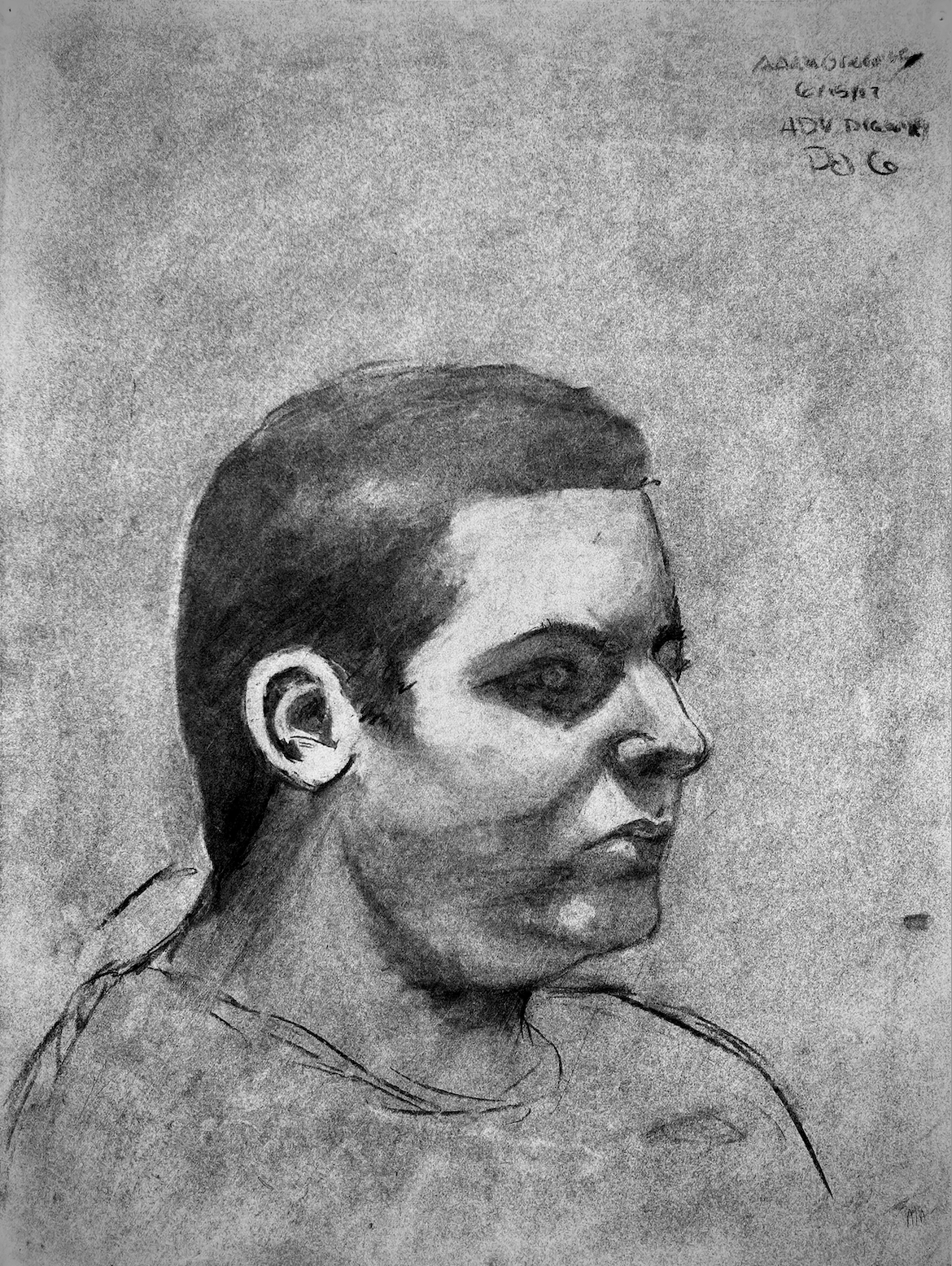
"Freshman Portrait Study 3 : Sarah" - An assignment from the Advanced Drawing 1 course that I took during my freshman year at Staples High School. This exercise required one student to sit in the center of the room, and serve as a model while the rest of the class was tasked with creating a portrait of them. This particular student chose to wear a set of plastic elf ears to school on the day that she was chosen to be the model for the class, thus, they were included in my piece. This was one part of the final project for my freshman year of high school art class, and forced me to utilize everything I had learned about negative space, proportion, value, and the human face. It was one of the first times in my artistic journey that I had successfully completed a portrait, and in hindsight, it was a pivotal moment in my development as an artist. - Charcoal on Paper - 18 x 24 - 2017
"Freshman Portrait Study 2 : Alex" - An assignment from the Advanced Drawing 1 course that I took during my freshman year at Staples High School. This exercise required one student to sit in the center of the room, and serve as a model while the rest of the class was tasked with creating a portrait of them. This was one part of the final project for my freshman year of high school art class, and forced me to utilize everything I had learned about negative space, proportion, value, and the human face. It was one of the first times in my artistic journey that I had successfully completed a portrait, and in hindsight, it was a pivotal moment in my development as an artist. - Charcoal on Paper - 18 x 24 - 2017
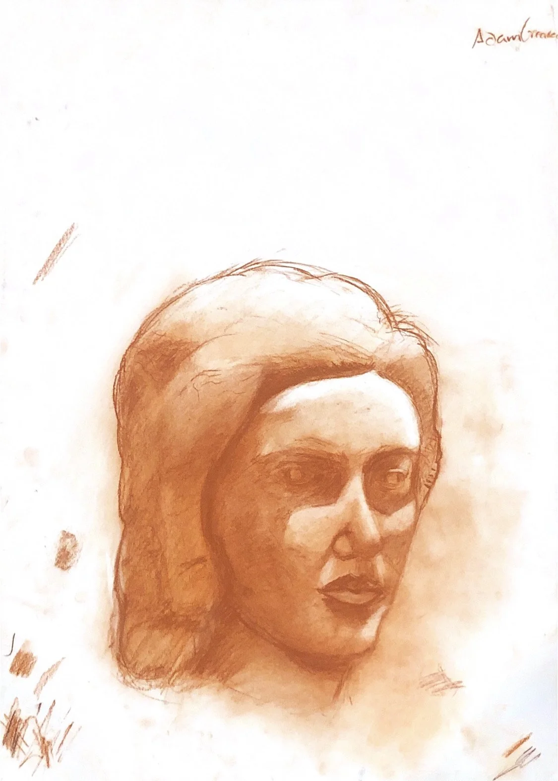
"Freshman Portrait Study 1" - An assignment from the Advanced Drawing 1 course that I took during my freshman year at Staples High School. The assignments required students to render a still life featuring a stone bust of a woman's head. While representing the correct proportions of a human face, the bust lacked definition. Therefore, the primary goal of the exercise was to observe the way that light interacted with the bust, and to accurately render the shadows that were cast across the face. Once we had recreated the shape of the shadows, we could then begin to further refine our pieces by adding and subtracting value where it was necessary, and to further define the busts facial features. This assignment was the culmination of weeks of study on both value, and the proportions of the human face. - Orange Conte Crayon on Paper - 18 x 24 - 2017
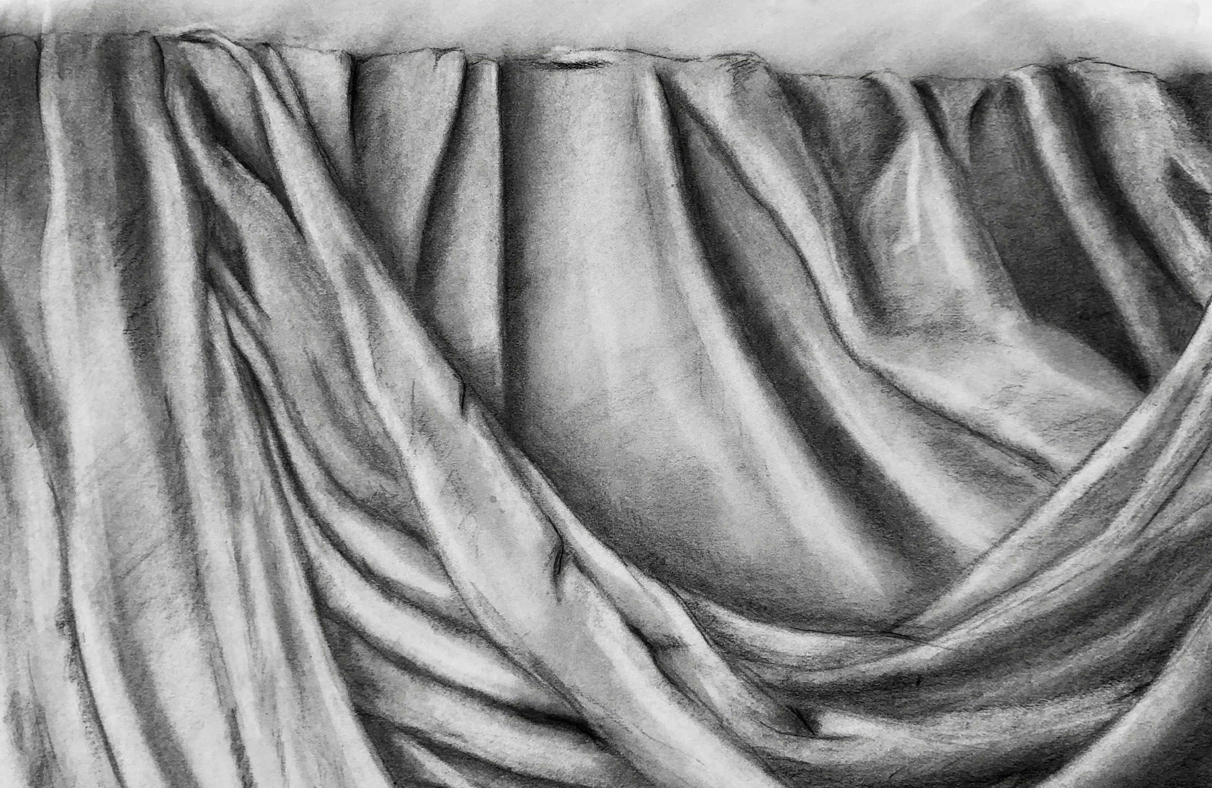
"Drapery Study" - An assignment from the Advanced Drawing 1 course that I took during my freshman year at Staples High School. The assignment required students to render a still-life that featured a piece of draped fabric. It was the culmination of several weeks of study regarding value and shading. - Charcoal on Paper - 11.5 x 17 - 2017
